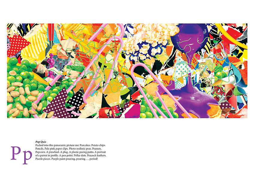
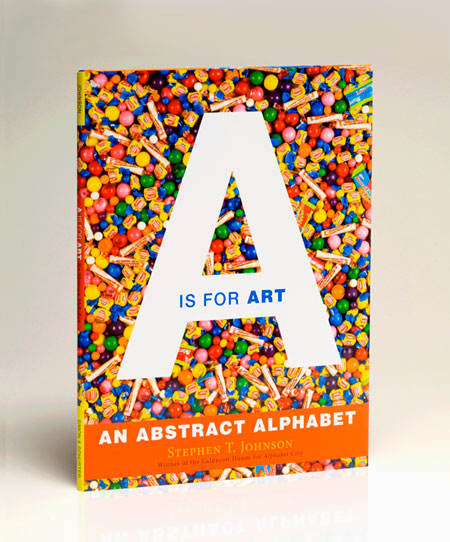
 Part children’s book and part lesson in twentieth-century artistic movements, Stephen T. Johnson’s A is for Art: An Abstract Alphabet is at the avant-garde of alphabet expressionism. Cubism is here, but the work explores the influence of dada and its children–surrealism, pop art, and conceptual art–and other styles such as abstract expressionism and color field painting. The result is a provocative meditation on art and language.
Invoking the mid-twentieth-century French avant-garde lettrist (letter-centered) work of François Dufrêne, Johnson in Arrangement No. 1 tears type from, as he describes in a caption accompanying the work, “an array of abstract bits of advertisements,” arranging them across strips of vivid orange. 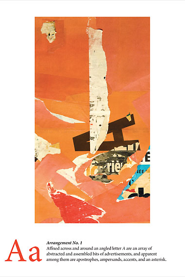 Amplifying the “A”s, Johnson describes how he has aligned small “apostrophes, ampersands, accents, and an asterisk,” around a dark “angled letter A.” Recalling American artist Man Ray’s Mystery of Isidore Ducasse, which is a blanket-and-twine-wrapped sewing-machine-sized object (it is a sewing machine, but the viewer cannot see it), Johnson’s Wrapped Wishes – devoted to letter “W” – invites the viewer to imagine what she or he sees. Wax, wool, and wire wrapped around unknown objects entice us to “wonder what is within.” In the aptly titled Recycled, a readymade assemblage of red and blue rubber bands spans a resin-filled frame. Encouraging the proliferation of “R”s, Johnson calls it a “rectangular receptacle,” and describes the bands as “rendered rigid by resin.”
In his art, Johnson maximizes the possibilities of each letter. The punnily titled Ice Cream Floats presents, as he writes, “an installation of individually illuminated, isolated, immobilized immersed and inverted identical insoluble imitation ice cream cones.” As that description suggests, these objects are multi-layered alphabet games, with images and captions that resonate in many directions. 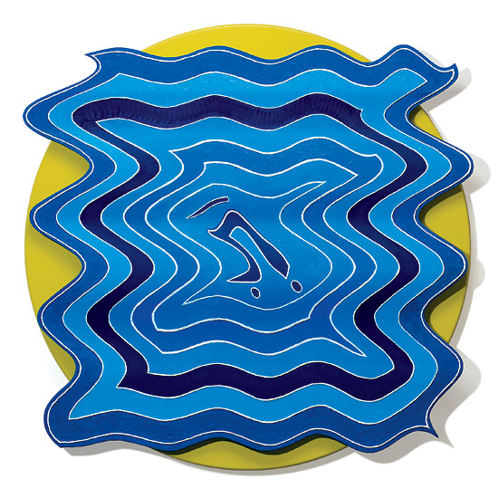 The op art (optical art) piece, Untitled (from the Undulation Series, 2006-2007), incorporates an “upside down, underlined upper case U with umlaut,” against an ultramarine blue background that appears to undulate. Jambalaya offers an homage to French-born American artist Arman’s “accumulations,” such as his Poubelle Papier (Wastepaper Basket) , while exploring “J” with, as Johnson’s caption notes, “Jampacked juxtapositions of jagged, jammed, joined and jumbled junk.” Careful examination reveals multiple iterations of “J” tucked into a fold of metal or at the intersection of one aluminum slice and another. As with all of Johnson’s works, the more you look, the more you see.
A is for Art: An Abstract Alphabet takes the letter-hunting game of Johnson’s Caldecott Honor-winning Alphabet City (1995) to another level. That book’s clearly articulated, easy-to-find letters should please those for whom the alphabet is a recent acquaintance or a passing interest. 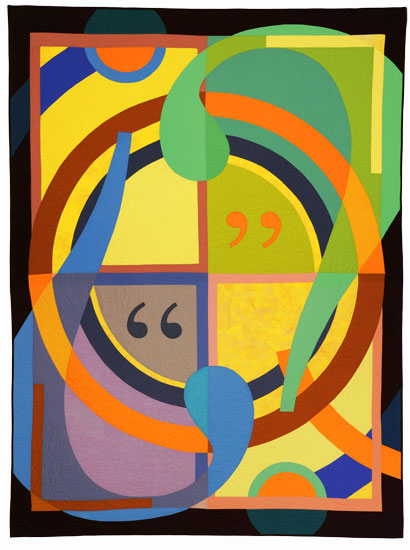 But An Abstract Alphabet is for hard core abecedarians, alphabetic connoisseurs who crave a richer experience. As such, Johnson’s work is among those alphabet books–such as Dr. Seuss’s On Beyond Zebra! (1955) and Michael Chesworth’s Alphaboat (2002)–that probe the paradox of language, a system practical and impractical, a means of communication and a game played for the fun of it.
Oscillating between each side of the paradox, Johnson’s densely allusive works abstract letters from their function and bind them to their function. Packing each alphabetic portrait full of references makes meanings multiply, reminding us how words always have indications elsewhere. Yet, even as it highlights language’s slipperiness, Johnson’s An Abstract Alphabet also forges connections between words and things. Indeed An Abstract Alphabet might also be called Concrete Alphabet: Johnson offers comically literal renderings of each letter, complete with witty, alliterative captions like Quiet Time Quilt’s “Queen size quilt, quartered by quadrants, with quadrilaterals, question marks and quotation marks.” The work has all of these features, along with the attributes of examples of late-1960s American art such as the geometric stripes of Frank Stella’s shaped canvases or the bold typography of Robert Indiana’s sculptural poem LOVE.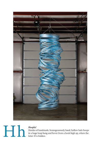
Beyond exploring language and artistic approaches, Abstract Alphabet catalogues Johnson’s artistic versatility. As an artist, he is capable of rendering realistically detailed portraits, painting abstract mathematical ideas, and creating minimalist installations. As a realist, he gives details to the parrot in Pop Quiz, such as the texture of the bird’s red feathers and a sharp curved beak. Exploring mathematical concepts, his Golden Sections depicts the golden ratio, incorporating a Fibonacci Spiral – a mapping of the Fibonacci Sequence, where each number is the sum of its two predecessors (1, 1, 2, 3, 5, 8, 13, 21, and so on). The hanging hollow hula-hoop forms in Johnson’s Hoopla! recall the pliant minimalist works of German-born American sculptor Eva Hesse (another “H” word!). Through painting, collage, sculpture, and readymades, Johnson’s Abstract Alphabet is playful, questioning, and profound.
Note: this originally appeared in Alphabet Soup: Work by Stephen Johnson, Jim Munce, Tony Fitzpatrick (exhibition at Beach Museum, Kansas State University, Manhattan, KS, 4 April — 3 Aug. 2008); an earlier version accompanied An Abstract Alphabet: New Works by Stephen Johnson (exhibition at Spencer Museum of Art, University of Kansas, Lawrence, KS, 19 May – 5 Aug. 2007).

