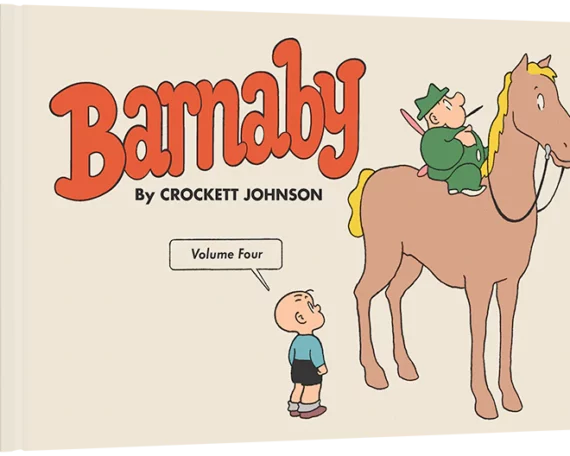
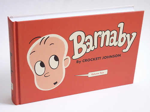
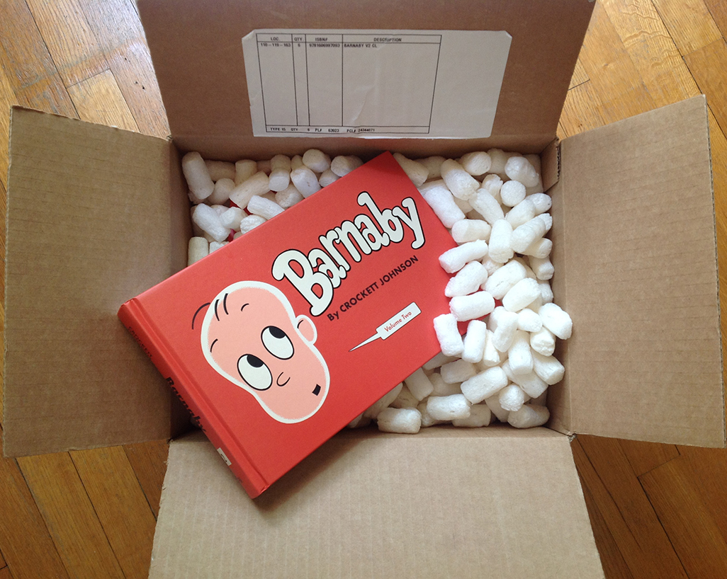
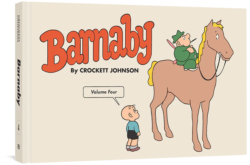
Archive for Fantagraphics

Barnaby, Small Scandinavian Investors, and Dapper Dan: Can you help identify these allusions? UPDATE: Mysteries Solved!

Crockett Johnson’s Barnaby (1942-1952) was both fantasy and topical satire. As noted on an earlier post, each of Fantagraphics’ 5-volume Barnaby series will have notes to explain the topical comments and any other references that may elude the average reader.

I’ve now finished the notes and Afterword for Barnaby Vol. 2: 1944-1945 (2014).

Almost.

There are two allusions that elude me.  Perhaps you can help?  Here are my questions along with the two relevant strips, which I’ve scanned from the Del Rey paperbacks (we’re using better versions of these strips in the volume itself — don’t worry).

Crockett Johnson, Barnaby, 28 Feb 1945

1. For instance, that Scandinavian Pixey, who— (28 Feb. 1945). This seems to be a reference to a specific (possibly diminutive) investor of Scandinavian descent, but I haven’t he foggiest idea as to whom it might be. As you can see in the strip above, Mr. Baxter says “Investment bankers don’t consider Pixies good risks, as a rule—.” He then adds, “Oh, they HAVE made a few exceptions…” and makes this comment.  So, clearly, at least some of Johnson’s readers would have caught this reference.

Crockett Johnson, Barnaby, 27 Apr 1945

2. Dapper Dan’s Outlet Emporium (27 April 1945).  If this is a reference to a specific business, I haven’t been able to find it.  When I was a kid, there was a Dapper Dan toy: a bald-headed man’s face, behind plastic. Using a magnet, you could move the little metal shavings (also encased in the plastic), and give him some hair, a moustache, beard.  But this can’t be it.  In the film O Brother, Where Art Thou? (2000), there’s Dapper Dan pomade, but this is a fictional brand, evidently used only in the film.  I need something that may have been around in 1945.

And, yes, of course, I’ll give credit where it’s due. (I realize that getting one’s name in the Acknowledgments is a rather small “prize” for your help, but,… well, I will to the Acknowledgments the names of those who help identify these two — unless you tell me you don’t want to be identified, that is.)  Thanks in advance for any thoughts you may have.

The first Barnaby volume is in press, and will be out in May or June. You can order it from Fantagraphics.

Barnaby, Volume 1

UPDATE, 4:15 pm.  Within less than an hour, both mysteries appear to be solved.  Via Facebook, Mark Newgarden suggests Ivar Kreuger, “the Match King,” as the “Scandinavian” allusion.  This makes sense.  It’s the kind of allusion Johnson would make.  He’s already had O’Malley proudly identify himself as mentor to Charles Ponzi.

Brian Herrera suggests “Dapper Dan” Hogan, a legendary Irish mobster.  The mobster was known for his style, and indeed appears to be the origin of the nickname “Dapper Dan.” Johnson loved detective fiction & true crime stories. This is the sort of allusion he would make. So, combine the historical allusion with an Outlet Emporium and you get a not-too-reputable source of fashionable menswear, exactly the sort of place where a captain of industry (as O’Malley is, at this point in the narrative) would not be expected to shop — hence, the joke.

Mark also points out that the name “Dapper Dan” precedes Daniel Hogan.  It had been attached to products prior to that time.  And there’s even an Eddie Cantor song, says Brian.  So, all of this is grist for my mill — and the note!

THANKS, MARK AND BRIAN!


Leave a Comment

Maurice Sendak, Uncensored

The Comics Journal 302 (2013): coverComics people will already know what is being billed as (and probably is) Maurice Sendak’s Final Interview.  (It was conducted in 2011, and he died last May.)  So, I’m writing this for all the children’s literature people out there: here’s why you might want to read this interview, which appears in the latest issue (no. 302) of The Comics Journal.

Pre-publication, Sendak’s fantasy of assassinating President George W. Bush and Vice President Dick Cheney got the most publicity. People who didn’t know Sendak were shocked, not realizing that he was making a dark joke. That said, it’s no understatement to say that he truly despised the Bush administration. One of the first times he and I spoke (on the telephone), Maurice referred to President George W. Bush as “that fucking fuckface.” This was back in June 2001, before 9/11 became an opportunity to launch “pre-emptive war,” before Abu Ghraib, before warrantless wiretapping, before torture, and all the rest. Needless to say, Sendak’s opinion of the administration did not improve over time.

Yes, you read his nickname for Mr. Bush correctly. What’s particularly delightful about this interview is that it has not been expurgated. Often, reporters edit out Sendak’s exuberant profanity. Gary Groth (who conducted this interview) leaves it all in. As a result, when you read the interview, it sounds like Sendak talking with you. He loves Henry James, “Jew-hating motherfucker that he is.”  He has an irrational, “impersonal hatred” for Alec Baldwin, “that fat-faced fuck.”  And so on.

He and Groth talk a lot about movies, including why Buster Keaton is better than Charlie Chaplin, favorite actresses (Simone Signoret, Bette Davis, Carole Lombard) and why most contemporary films aren’t worth seeing. But they also talk about William Blake, Herman Melville, Salman Rushdie, Nathaniel Hawthorne, Franz Schubert, and Vincent Van Gogh’s wife.  It’s a wide-ranging interview, covering many subjects.

The Comics Journal: Sendak interview

As is always the case, Sendak is quotable:

On the creative process: “I’m trying to be honest with you. That you never feel you’ve gotten it right because you have a kind of vision, or a kind of feeling. But your body, your hands, the brush in your hand — nothing equips you to fulfill what the original impulse was. So the original impulse is the most exciting thing” (43).

On the publishing industry: “we cannot, I think, separate ourselves from our time. Like when I began in the ’50s … Young people were welcomed. New things were happening, a surge of energy, a surge of hope. A surge of happiness. And now it’s all dwindled. And so I say, look, I’m very lucky that’s when my time was. What a blessing that I could be there and then and be with editors and people in the publishing world who appreciated young people and wanted them to be crazy like I was. Nobody wants them now” (47).

On writing children’s books: “I get criticized for doing too many serious books. Why is there a dead child in your books? Why is there a chagrined mother? Because that’s the way it is. It works both ways. You either become very superficial and do it for the money, or you become very serious and you turn people off. And if it’s a book for children, my God! I would not know how to write a book for children. I’ve never written a book for children. And yet I’m known as a children’s-book writer and illustrator, OK?” (53).

Bonus: the interview is lavishly illustrated with both art from Sendak’s books and images from other works he mentions. There’s an essay by Alexander Theroux, and a reminiscence from Gene Deitch. (I also contributed an overview of Sendak’s career.) But the interview itself will be of greatest interest.

Though lengthy, the interview does not cover everything important. They don’t talk about Ruth Krauss, one of the key professional relationships in Sendak’s life. (For that, you’ll need to read Sendak’s “Ruth Krauss & Me: A Very Special Partnership” [Horn Book, May/June 1994] or my bio. of Johnson and Krauss.) But this was to have been as the first in a series of interviews, and so Groth never got to ask all of the questions he’d planned to. In any case, for a comprehensive interview with someone as accomplished as Sendak was, you would need an entire book.

Above all, in reading Groth’s interview, it’s great to hear Maurice’s voice — his salty, funny, grumpy, insightful, irascible voice — just one last time.

Related content at The Comics Journal:

Related content on this blog:

Leave a Comment

Barnaby, Vol. 1

Barnaby, Volume 1

The book went to press earlier this month, and will be out in the spring.  I can’t wait for you to see it.  Crockett Johnson’s Barnaby Volume 1 is truly a thing of beauty.

If you read any books published by Fantagraphics, this last sentence will not surprise you.  But in case you are not (yet) a Fantagraphics devotee, let me give you a little behind-the-scenes look at why this book looks so great.  (If you can’t wait to see a few glimpses, please scoot on over to Fantagraphics’ post on Barnaby Volume 1: it includes images and Daniel Clowes‘ rough sketch for the cover.)

Fantagraphics is perfectionistic in all the right ways.  At each phase of the process, Eric Reynolds — who is co-editing the Barnaby books with me — contacted me with specific questions.  Most recently, at page-proofs phase, we talked about the layout of my essay, as well as those by Chris Ware and Jeet Heer.  Dan Clowes put the epigraph for the first section of my essay in a Barnaby-style speech bubble.  I thought: that looks cool. Might we try the same treatment for the other epigraphs? We did, and liked the result.  Eric, Dan, and Fantagraphics designer Tony Ong also experimented with how to lay out my notes.  We proofread everything many times, had conversations about grammar and word choice.  Eric worked hard on getting the spacing just right on the back cover’s panels (visible, if too small to read clearly, on Fantagraphics’ post — and below).  If these details sound boring to you, they really shouldn’t.  This sort of keen attention to detail makes for a beautiful book.

Barnaby, Volume 1: cover

Fantagraphics works with the best people.  Daniel Clowes! Chris Ware! Jeet Heer!  Dan designed the book to look as if it were designed by Crockett Johnson in the 1940s.  When you look at (for example) the back cover, it does not look as if it was designed using contemporary software.  The lines look hand-ruled because (I believe) they were hand-ruled.  For the typeface, Dan used Futura because that’s the distinctive typeface of Barnaby — and, incidentally, of Ruth Krauss‘s The Carrot Seed, which Johnson illustrated & designed.  Chris wrote a beautiful, insightful introductory piece on Johnson and Barnaby.  I’m tempted to quote it here, but I think I’ll leave it as a surprise.  I will say, though, that there are few comics creators who can speak as lucidly as Chris can about how comics work.  I’ll also say that Chris’s piece will make you look at Harold (of purple crayon fame) in a new way.  And… that’s all I’ll say.  Comics scholar Jeet Heer’s introduction features the best description of Mr. O’Malley (Barnaby’s fairy godfather) that I’ve ever read: “half-pixie and half-grifter, an otherwordly being most at home in low-life dives and gambling dens, raider of other people’s fridges and cigar boxes, an inept wizard whose magic only works intermittently and often with unintended consequences, a self-mythologizer whose account of his own past glories is an improbable farrago of tall tales, a rhetorician quick to smooth over any difficulty with rococo eloquence and irrelevant digressions.”

Fantagraphics — specifically, Eric Reynolds — communicated with me clearly and regularly.  He was always clear, polite, and had the best interests of the project at heart.  A great guy to work with.  I’m delighted that we’ll be working together on volumes 2 through 5!  (We’re collecting the full ten-year run of Barnaby, 1942-1952, with two years in each volume.)

Finally, we could not have done this without the help of collectors who loaned us their newspapers or scanned strips — the Smithsonian, Harvard University, and Charles Cohen, in particular.  So.  Thanks to them!  Note to the curious: a complete collection of old newspaper strips are not just lying around in an archive.  You have to go looking for them.  It’s an enormous amount of work, and is one of the reasons Volume 1 took so long.  The other is Fantagraphics’ admirable perfectionism.

So.  This spring.  Barnaby Volume 1.  Get it!

Comments (2)

Clear Lines and Comics Luminaries: A Report from SPX

Crockett Johnson's Barnaby and the American Clear Line School. Left to right: Mark Newgarden, Daniel Clowes, Chris Ware, Eric Reynolds, Philip Nel. Photo by Paul Karasik.

It’s hard to put into words what it means to spend over a dozen years on a book, and then be able to talk about it with smart, talented people whose work I admire.  Saturday’s panel at the Small Press Expo — featuring Daniel Clowes, Mark Newgarden, Chris Ware, Eric Reynolds, and myself — was exactly that.  Titled “Crockett Johnson’s Barnaby and the American Clear Line School,” the panel aimed (among other things) to spread the word about Fantagraphics’ Complete Barnaby: Eric and I are co-editing, Dan is designing, Chris wrote an intro for Volume 1.  Since that book isn’t out yet (currently expecting a February ’13 pub date), it also enabled me to draw upon my dozen years of research for Crockett Johnson and Ruth Krauss: How an Unlikely Couple Found Love, Dodged the FBI, and Transformed Children’s Literature (which is just out, and features a cover by Chris).

For 50 minutes, we had an illuminating conversation about Crockett Johnson, Barnaby, and how comics work.  Few people understand comics as well as Mark, Dan, and Chris do.  If you’ve ever heard Chris Ware speak or read an interview with him, you’ll know that he is one of a very few comics creators who can articulate, clearly & with precision, how particular comics work — and do this all without notes, speaking in what sound like perfectly punctuated paragraphs.  He was just as sharp, the following day, on the Building Stories conversation between him and Dave Ball.

Crockett Johnson's Barnaby and the American Clear Line School. Left to right: Mark Newgarden, Daniel Clowes, Chris Ware, Eric Reynolds, Philip Nel. Photo by Paul Karasik.

It’s also fascinating to me that three quite different cartoonists are drawn to Barnaby. With the exception of Ice Haven (my favorite Clowes book, incidentally), Daniel Clowes’ works have the fewest visual similarities to Johnson’s style. Chris Ware’s precise line recalls Johnson’s, though he favors more detailed pages than Johnson does. Mark Newgarden’s line is thicker and looser than Johnson’s, though his aesthetic is closer to Johnson’s succinct minimalism.  What all four share in common is a sharpness, a precision that gives their work a vital presence on the page.  All four understand the visual grammar of cartoons; they are fluent in the language of images.

Commercially, SPX was a success, also. Fantagraphics kindly sold copies of my biography (we sold all of them), and set up signings for me at their booth — the first of which found me sitting next to Dan.  Chris very generously signed the prints of his cover, for my Johnson-Krauss bio., and I sold about a dozen of those, too.

Daniel Clowes and Philip Nel signing books at the Fantagraphics booth. Photo by Alvin Buenaventura.

But, for me, what made it special was getting to hang out with so many great artists, writers, editors, & scholars. I never thought I’d find myself at dinner with Dan Clowes, Chris Ware, Charles Burns, Adrian Tomine, and Françoise Mouly. When I told Mike Deforge (an up-and-coming comics creator who was also at that dinner) that I felt like I’d been invited to the grown-ups’ table and wondered how the heck I got there, he admitted that he felt the same way.  So, a hearty thanks to Alvin Buenaventura for inviting us! (On that note, check out Daniel Clowes: Modern Cartoonist, edited by Alvin & with an essay by Chris.)

There are many other highlights — hanging out with Mark N. & Megan Montague Cash, getting to show them original Barnaby strips at the Smithsonian, meeting fellow Crockett Johnson fans, other comics scholars, seeing Warren Bernard’s astonishing personal collection of comics (at his house), discovering a group of comics artists engaged in an ongoing alphabet project, and so much more.  And the Barnaby panel was a career highlight.

Thanks again to Dan, Mark, Chris, and Eric for making it happen.  Thanks to Bill Kartalopoulos for including us in his great program.  And thanks to everyone I met for a fantastic SPX.

Photos by Paul Karasik (top two) and Alvin Buenaventura (lower one). Thanks, fellas!  Enjoyed seeing you, too!

Comments (3)