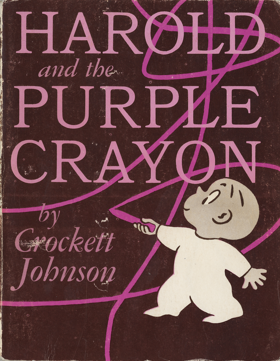
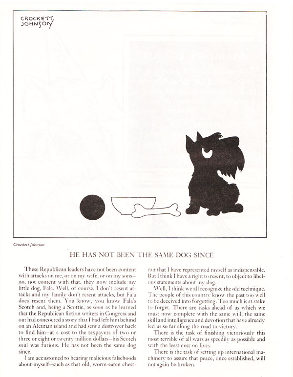
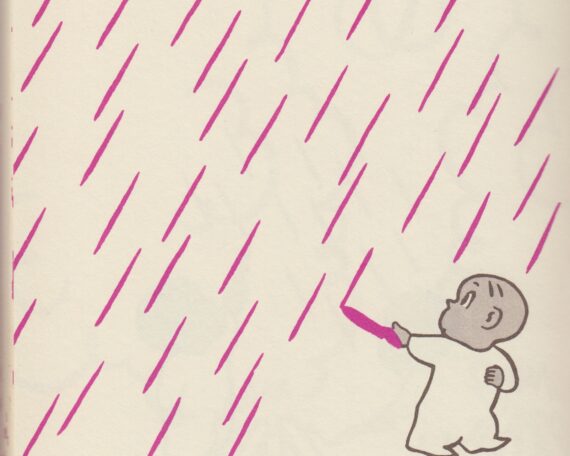
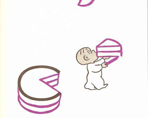
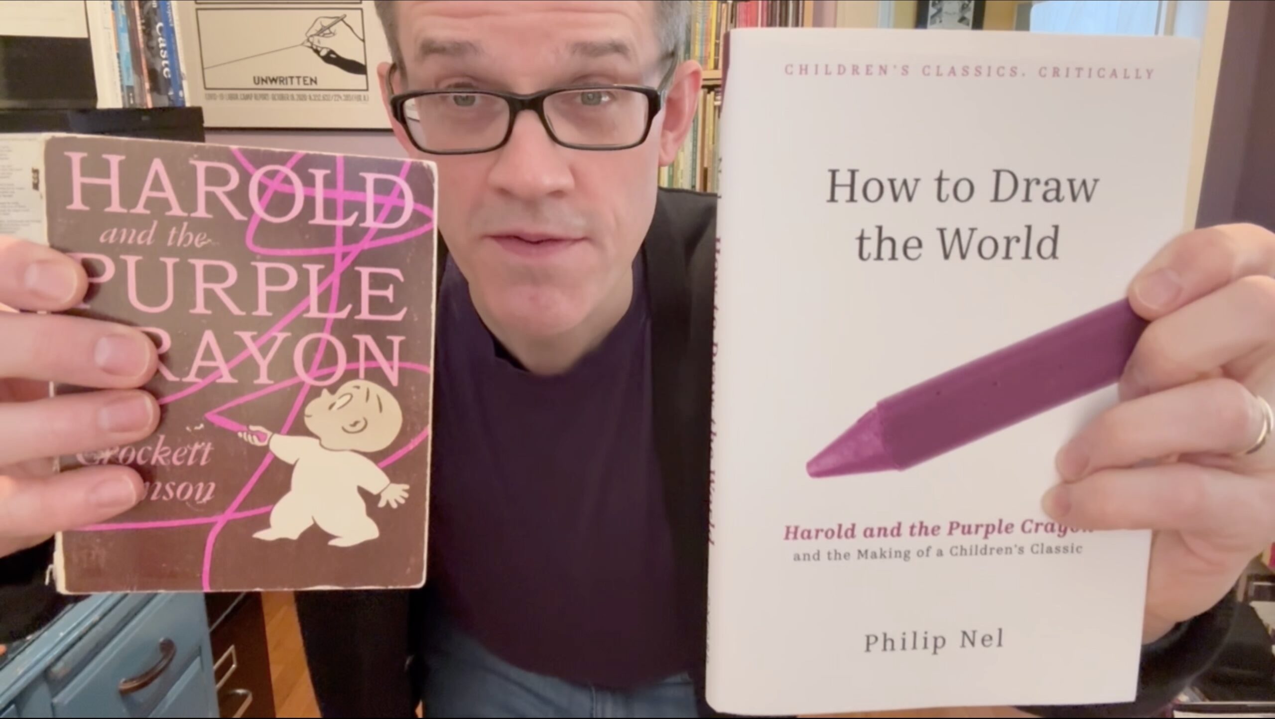
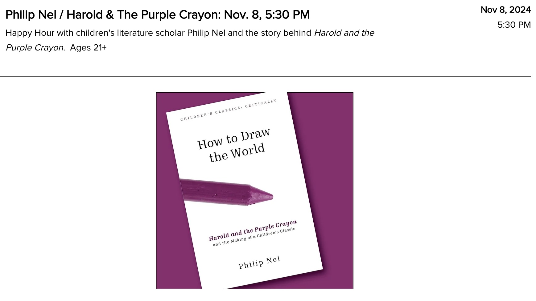
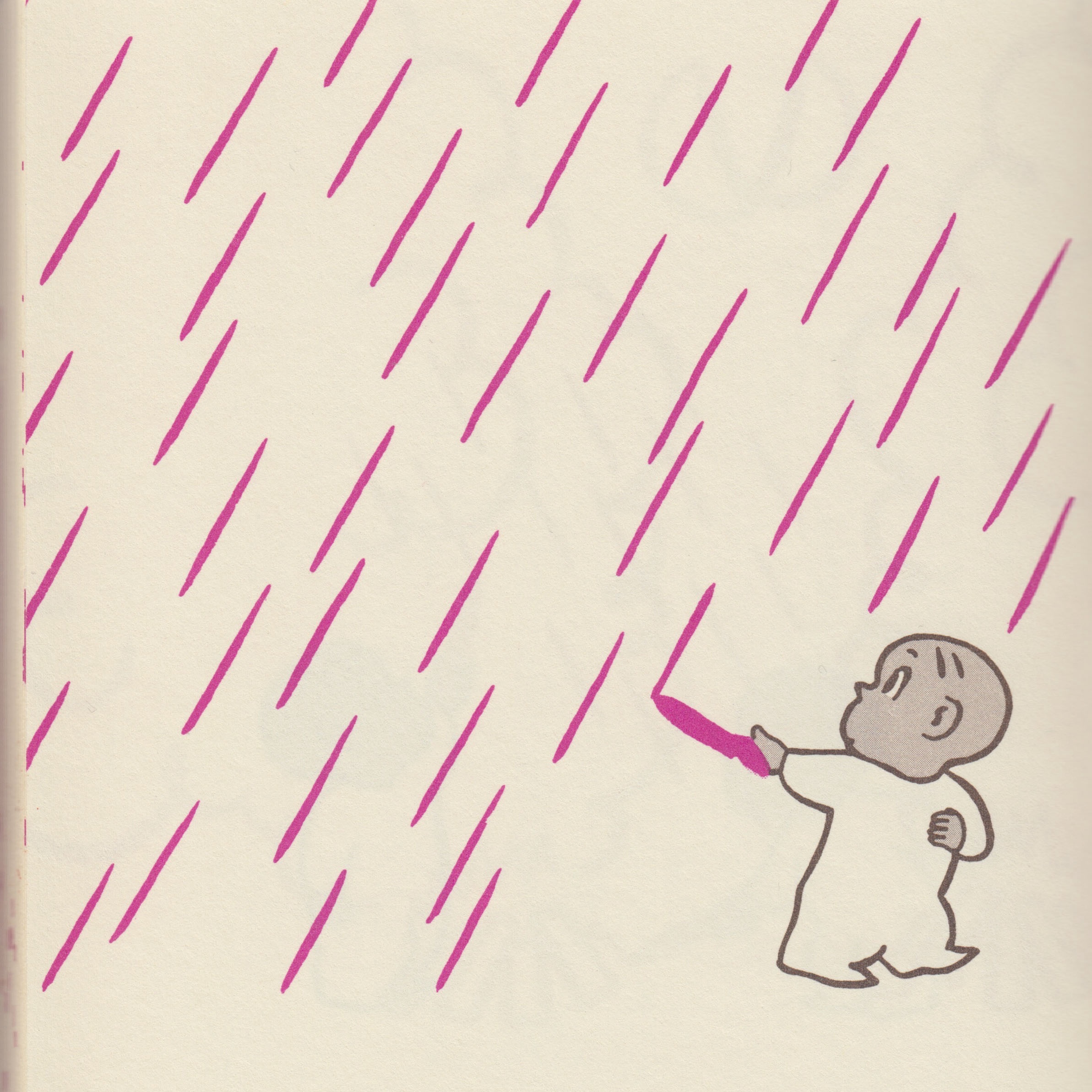
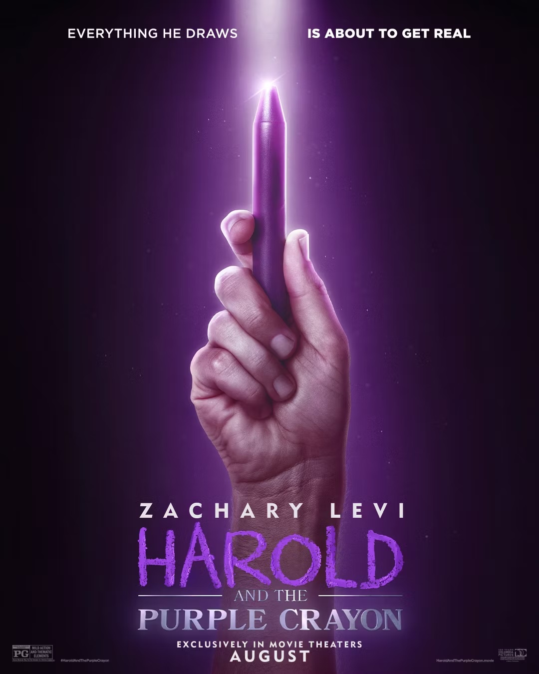
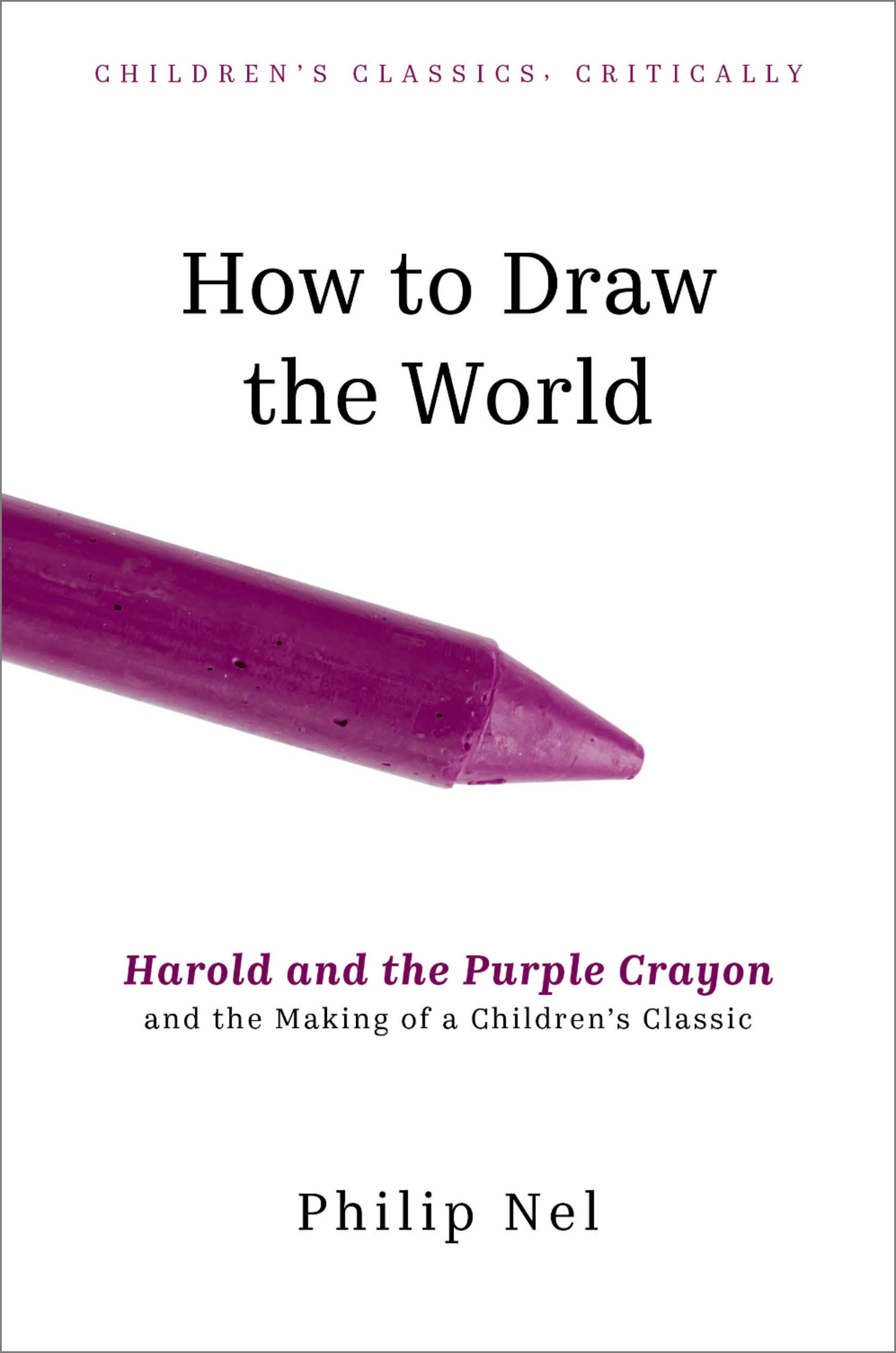
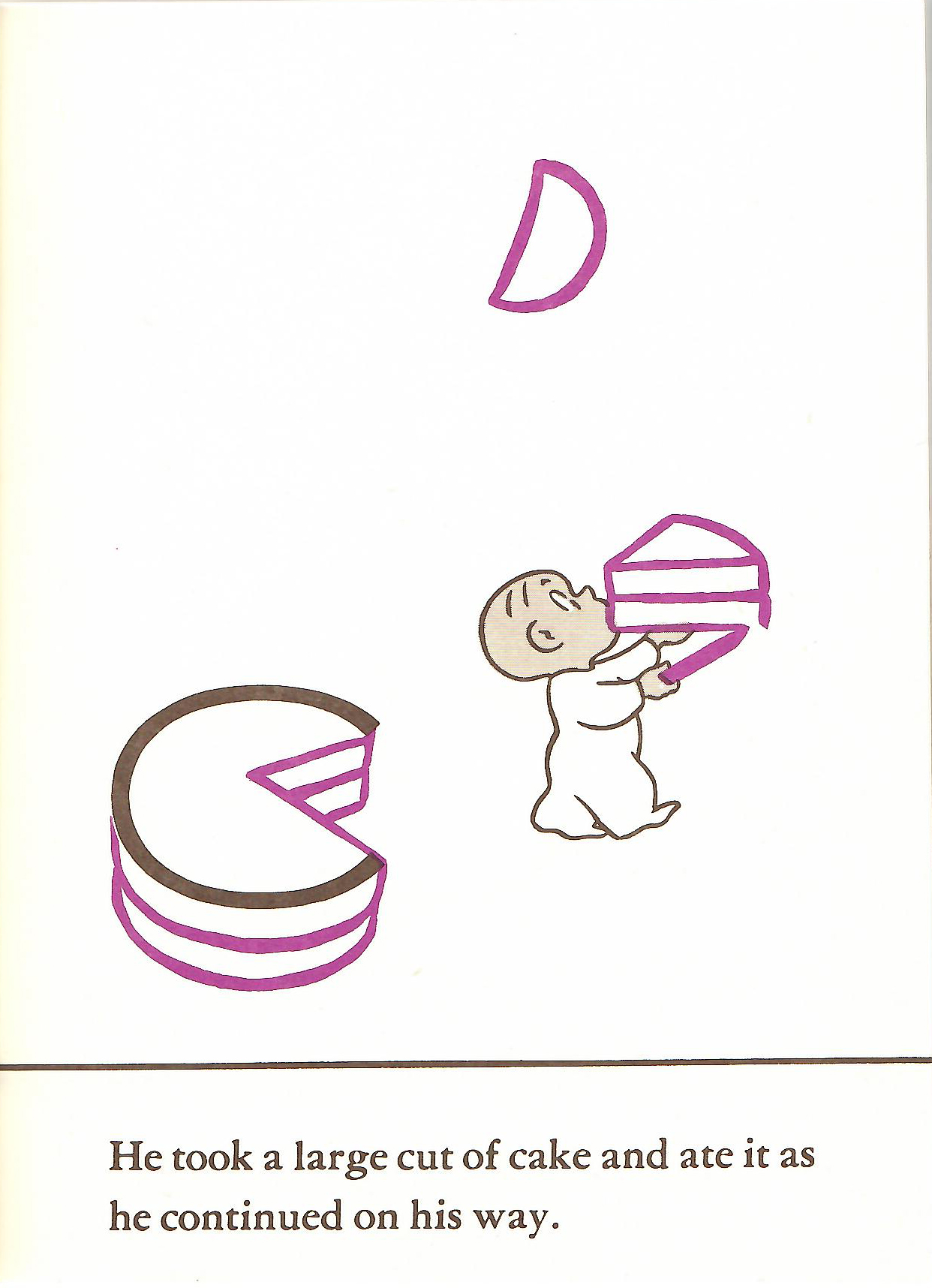
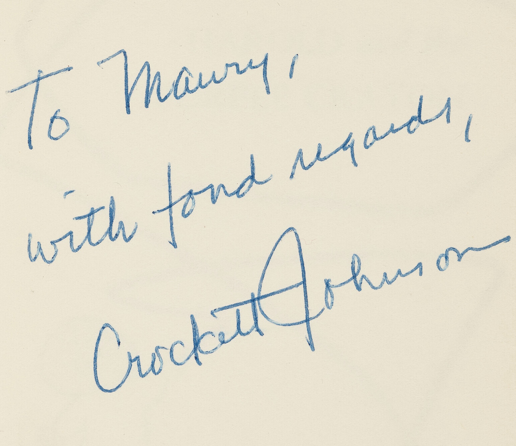
Archive for Crockett Johnson

A Manifesto for Children’s Literature; or, Reading Harold as a Teenager

Those of us who read, create, study, or teach children’s literature sometimes face skepticism from other alleged adults.  Why would adults take children’s books seriously?  Shouldn’t adults be reading adult books?

There are many responses to these questions:

  1. Children’s books are the most important books we read because they’re potentially the most influential books we read. Children’s books reach a young audience still very much in the process of becoming. They stand to make a deeper impression because their readers are much more impressionable.
  2. Adults who dismiss children’s literature neglect their responsibilities as parents, educators, and citizens. What future parents, teachers, doctors, construction workers, soldiers, leaders, and neighbors read is of the utmost importance, if for no other reason than some of us will continue to live in the world they inherit. If books leave such a powerful impression on young minds, then giving them good books is vital.
  3. Almost no children’s literature is written, illustrated, edited, marketed, sold, or taught by children. Adults — and adults’ idea of “children” — create children’s books. It’s profoundly hypocritical for an adult to suggest children’s literature as unworthy of adult attention. Indeed, adults who make such claims are either hypocrites, fools, or both.
  4. Children are as heterogeneous a group as adults are. There is no universal child, just as there is no universal adult. Defining the readership of any work of “children’s literature” is a tricky, sticky, complex task. Paradoxically and as the term itself indicates, “children’s literature” is defined by its audience — it’s for children. It thus a literature for an audience whose tastes, reading ability, socio-economic status, hobbies, health, culture, interests, gender, home life, and race varies widely. Children’s literature is literature for an unknowable, unquantifiable group. The very term “children’s literature” is a problem. Only someone who has never thought about children or what they read could argue that children’s literature does not merit serious consideration.
  5. Children’s literature has aesthetic value. Good children’s books are literature. Good picture books are portable art galleries. If we don’t take children’s literature seriously, then we diminish an entire art form and those who read it. We also prevent ourselves from being able to distinguish quality works from inferior ones — thus neglecting our responsibilities outlined in no. 2, above. This is not to suggest that we can or should all agree on what is a great children’s book. We can’t and we shouldn’t. What we can and should do is care about what makes children’s books bad or good, average or classic, banal or beautiful.

But my focus in this post is less on those preceding five points (or the many other points that could be added) and more on a sixth point: that children’s books have much to give those of us who are no longer children. There are levels of meaning we may have missed when we read the book as a child. There are experiences adults have that grant us interpretations unavailable to less experienced readers — just as children may arrive at interpretations unavailable to adults who have forgotten their own childhoods. In children’s books, there is art, wisdom, beauty, melancholy, hope, and insight for readers of all ages.

Crockett Johnson, Harold and the Purple Crayon (1955): coverWhat inspires me to make this sixth claim is that I have no memory of reading Harold and the Purple Crayon as a child. As an adult, I created a website devoted to the book’s creator, Crockett Johnson, and wrote a biography of Johnson and his wife, fellow-children’s book writer Ruth Krauss. But the book that inspired both website and biography is completely absent from my memories of early childhood.

The book does appear in memories of those memories. In eighth grade, when I had long since “graduated” into reading chapter books, my mother got a job teaching at a private school, thus enabling my sister and I to attend the school for free. Once a week (or was it once a month?), there was a faculty meeting after the end of the school day. During that meeting, my sister and I were left alone in the school library to do our homework. She did her homework. I did not. Instead, I wandered over to the picture books and began reading them. There, I rediscovered Harold and the Purple Crayon, a book I then remembered fondly from my pre-school days. I also realized that there were other books about Harold — Harold’s Trip to the Sky, Harold’s ABC. Had I read these other Harold stories when I was younger? I wasn’t sure. But I knew they were just as enchanting as the first Harold book.

So, at the age of 14 — an age when you might expect a person to be reading Young Adult novels — I began to collect paperbacks of Crockett Johnson’s Harold books.

I don’t know what needs were fulfilled by those particular words and pictures. Perhaps it was the books’ presentation of the imagination as a source of power and possibility. Maybe Harold’s iconic, clear-line style better enabled me to identify with him as he, and his crayon, navigated an uncertain, emerging landscape.

For that matter, I don’t know why, as a freshman in college, I adopted as my bedtime reading A. A. Milne’s The World of Pooh and The World of Christopher Robin. (The former contains both Winnie-the-Pooh and The House at Pooh Corner; the latter collects all the verse from When We Were Very Young and Now We are Six.)

My point is that books “for children” can speak to people of all ages and backgrounds — if we are ready to listen. It’s hard to predict when or why we will be ready to listen. It is indeed dangerous to assume that recommended age-ranges on the backs of books will tell us anything about who may read those books. When I read and re-read the Harold stories at age 14, the books did not then have age ranges on them, though I note that a more recent copy of Harold’s Fairy Tale claims it’s for “Ages 3 to 8.” As Philip Pullman has said of his own work,

I did not intend the book for this age, and not that; for one class of reader, and not others. I wrote it for anyone who wants to read it, and I want as many readers as I can get, and I want to meet them honestly…. For a book to claim “This was written for children of 11+”, when it simply wasn’t, is to tell an untruth.

Exactly.

Books “for children” or “for teenagers” are books for all who are ready to listen to them. They are for all who recognize that art cannot be confined within such narrow labels.

Comments (16)

Barnaby, Small Scandinavian Investors, and Dapper Dan: Can you help identify these allusions? UPDATE: Mysteries Solved!

Crockett Johnson’s Barnaby (1942-1952) was both fantasy and topical satire. As noted on an earlier post, each of Fantagraphics’ 5-volume Barnaby series will have notes to explain the topical comments and any other references that may elude the average reader.

I’ve now finished the notes and Afterword for Barnaby Vol. 2: 1944-1945 (2014).

Almost.

There are two allusions that elude me.  Perhaps you can help?  Here are my questions along with the two relevant strips, which I’ve scanned from the Del Rey paperbacks (we’re using better versions of these strips in the volume itself — don’t worry).

Crockett Johnson, Barnaby, 28 Feb 1945

1. For instance, that Scandinavian Pixey, who— (28 Feb. 1945). This seems to be a reference to a specific (possibly diminutive) investor of Scandinavian descent, but I haven’t he foggiest idea as to whom it might be. As you can see in the strip above, Mr. Baxter says “Investment bankers don’t consider Pixies good risks, as a rule—.” He then adds, “Oh, they HAVE made a few exceptions…” and makes this comment.  So, clearly, at least some of Johnson’s readers would have caught this reference.

Crockett Johnson, Barnaby, 27 Apr 1945

2. Dapper Dan’s Outlet Emporium (27 April 1945).  If this is a reference to a specific business, I haven’t been able to find it.  When I was a kid, there was a Dapper Dan toy: a bald-headed man’s face, behind plastic. Using a magnet, you could move the little metal shavings (also encased in the plastic), and give him some hair, a moustache, beard.  But this can’t be it.  In the film O Brother, Where Art Thou? (2000), there’s Dapper Dan pomade, but this is a fictional brand, evidently used only in the film.  I need something that may have been around in 1945.

And, yes, of course, I’ll give credit where it’s due. (I realize that getting one’s name in the Acknowledgments is a rather small “prize” for your help, but,… well, I will to the Acknowledgments the names of those who help identify these two — unless you tell me you don’t want to be identified, that is.)  Thanks in advance for any thoughts you may have.

The first Barnaby volume is in press, and will be out in May or June. You can order it from Fantagraphics.

Barnaby, Volume 1

UPDATE, 4:15 pm.  Within less than an hour, both mysteries appear to be solved.  Via Facebook, Mark Newgarden suggests Ivar Kreuger, “the Match King,” as the “Scandinavian” allusion.  This makes sense.  It’s the kind of allusion Johnson would make.  He’s already had O’Malley proudly identify himself as mentor to Charles Ponzi.

Brian Herrera suggests “Dapper Dan” Hogan, a legendary Irish mobster.  The mobster was known for his style, and indeed appears to be the origin of the nickname “Dapper Dan.” Johnson loved detective fiction & true crime stories. This is the sort of allusion he would make. So, combine the historical allusion with an Outlet Emporium and you get a not-too-reputable source of fashionable menswear, exactly the sort of place where a captain of industry (as O’Malley is, at this point in the narrative) would not be expected to shop — hence, the joke.

Mark also points out that the name “Dapper Dan” precedes Daniel Hogan.  It had been attached to products prior to that time.  And there’s even an Eddie Cantor song, says Brian.  So, all of this is grist for my mill — and the note!

THANKS, MARK AND BRIAN!


Leave a Comment

Shrdlu, Minsky, Burke & Hare

When you look at Chris Ware’s post-Newtown New Yorker cover, the looks on the parents’ faces call to mind the previous month’s massacre in Connecticut. But 10 years from now, readers (I hope) will see just a scene of children entering a school as their parents watch intently. In creating the notes for Volume 2 of Crockett Johnson’s Barnaby, I’m facing this challenge as I work to help contemporary readers follow the political satire.

Johnson’s comic strip was a fantasy, and you can enjoy it without knowing the contemporary scene of 1944 to 1945.  But I’m one of those people who wants to know. In reading Fantagraphics’ beautiful Krazy Kat series, I was always a little disappointed when one of Herriman’s obscurities lacked an explanation in the book’s “Ignatz Debaffler Page.”  So, for Fantagraphics’ equally beautiful Barnaby series (the first volume of which should be available in March), I’m catering to the reader ­— like me — who wants to turn to the back of the book, and find an explanatory note.

In addition to being topical, Barnaby was also wide-ranging in its allusions. Johnson’s characters offer wry commentary on American politics in the 1940s, but also reflect his interests in mathematics, mystery novels, and popular culture. There are many referents that might be obscure even to his readers in 1944 and 1945.  On 28 September 1945, the lettering on a con-artist swami’s door reads “SWAMI ESYAYOUISIJA.”  I spent some time staring at this before realizing that the swami’s surname is “YES” in four languages: Pig Latin (ESYAY), French (OUI), Spanish (SÍ), and German (JA).

ShrdluEarlier that same month, Barnaby introduces a printer’s devil named “Shrdlu.”  He’s a friend of Barnaby’s fairy godfather, Mr. O’Malley. Why Shrdlu? A linotype machine arranged the letters in order of how frequently they were used. In English, that order is ETAOIN SHRDLU. On the machine, the first column (reading downward) was ETAOIN, and the second was SHRDLU. Thus, as the OED explains, “ETAOIN SHRDLU” are “The letters set by running a finger down the first two vertical banks of keys on the left of the keyboard of a Linotype machine, used as a temporary marking slug but sometimes printed by mistake; any badly blundered sequence of type.” So, Shrdlu is the ideal name for a newspaper employee who, as he explains on 4 September, is “responsible for all omissions, typographical errors, pied lines, switched captions and misspelled names.”

etaoin shrdlu from Linotype: The Film on Vimeo.

On 28 March 1944, O’Malley says he’s a devotee of Minsky’s brand of humor. Who? He’s referring to the comics employed by the Minsky Brothers, who were more famous for their risqué burlesque shows. Johnson’s also making an in-joke: one Minsky comedian, Jimmy Savo, provided some inspiration for the character of Mr. O’Malley.

O'Malley phones Burke & HareNear the beginning of his career as a Wall Street financier, Barnaby’s fairy godfather decides to phone a brokerage firm. So, he checks the phone book, and says “This firm’s name has a familiar ring to it. ‘Burke & Hare.’” The name may be familiar, but it’s not the kind of familiarity one associates with a reputable firm. It recalls the infamous Burke and Hare Murders of 1828. Over the course of 10 months in Edinburgh, Scotland, William Burke (1792-1829) and William Hare (1792-?) murdered 16 people, and sold the corpses to Dr. Robert Knox, who needed cadavers for his anatomy lectures.

Even though you don’t require these notes to enjoy the strip, a thorough editor (that’s me!) provides them… for the few readers who (like me!) want to know.

Barnaby Volume 2: 1944-1945 should be out in early 2014, and Barnaby Volume 1: 1942-1943 is due in March. I expect to receive an advance copy in the next week or two.

Note: All Barnaby images are from the Del Rey paperbacks (1985-1986). For the Fantagraphics books, expect higher-quality images and paper.

Barnaby, Volume 1

Coming in March, from Fantagraphics: Barnaby Volume 1: 1942-1943, co-edited by Philip Nel and Eric Reynolds. Design by Daniel Clowes. Introduction by Chris Ware. Essays by Jeet Heer and Dorothy Parker. Biographical Afterword and Notes by Philip Nel. You can pre-order it now.

Comments (5)

Antonio Frasconi (1919-2013)

Frasconi

Antonio Frasconi, woodcut artist and children’s-book illustrator, died on January 9th at the age of 93. I heard about it this morning, but I’ve yet to find a full obituary (apart from this brief notice by Joey of Purchase College). So, I’m writing a few words.

He was born in Buenos Aires, to Franco Frasconi (a chef) and the former Armida Carbonia (a restaurateur), both of whom had emigrated from Italy during World War I.  Young Antonio grew up in Montevideo, where, by age 12, he had become a printmaker’s apprentice and, by his teens, was seeing his satirical cartoons appear in local newspapers.

In the 1940s, he began working in woodcuts, producing work which won him a scholarship from the Art Students League in New York.  To study there, he emigrated to the United States in 1945.  By 1948, he had his first exhibit — at the Weyhe Gallery, also in New York.

But the reason I know about him are his beautiful illustrations for children’s books. He married fellow artist Leona Pierce in 1951, and the birth of their first son, Pablo, in 1952, inspired him to create work for young people. As Frasconi noted in a 1994 Horn Book interview, “the happiness he brought, both as an inspiration and as an audience for my work, made me think in terms of using my work as part of his education.”  Frasconi observed that, with his accented English, his own reading to Pablo was different than his wife’s reading to Pablo. He went to the library, looking for bilingual books, and, finding none, decided to create his own.

The result was the groundbreaking and beautiful See and Say: A Picturebook in Four Languages (Harcourt, 1955). It presents a series of objects, each named in in English (printed in black), in Italian (blue), French (red), and Spanish (green).  Illustrated in bright woodcut prints, the book is a great “first words” book for young children, and language education for any age. Though not the first children’s book Frasconi illustrated, it was the first one he both wrote and illustrated, and I highly recommend it. Used copies are not too hard to find, but this book (attention, New York Review Children’s Collection!) really ought to be brought back into print.

Antonio Frasconi, from See and Say (1955)

Antonio Frasconi, from See and Say (1955)

The images above come from The Ward-o-Matic‘s post on See and Say.  Visit the site to see more.

Back in 2000, I spoke with Mr. Frasconi because he was a very close friend of Crockett Johnson. Both men leaned left, had artistic influences that extended beyond children’s books, and held each other’s work in high regard. Indeed, Antonio’s political leanings inspired him to move — along with his family (Leona, Pablo, and Miguel) — to Village Creek, a planned integrated community that is directly adjacent to Rowayton, Connecticut, where Johnson and his wife Ruth Krauss lived.  That was in 1957.  The family met Johnson and Krauss soon after moving there, and quickly became friends.

photo of Antonio FrasconiThere were regular spaghetti dinners at Ruth and Dave’s house (Crockett Johnson’s real first name was “Dave,” and friends called him “Dave”).  Antonio illustrated Ruth’s The Cantilever Rainbow (1965), her greatest avant-garde children’s book.  When the Berkeley Free Speech Movement (1964-1965) got television coverage, Dave phoned Antonio so that he could come over and see it (at that time the Frasconis didn’t have a TV). So, the family went over and watched the protests. When Dave started serious painting, the Frasconis were among the first people he showed them to. As Miguel Frasconi recalled, Dave was “so excited,” as he explained to Antonio “the geometric properties of these pictures — like he had discovered something totally new.” At the time, Miguel thought: “this is an adult, and he’s as excited as a little kid.”

While my own brief acquaintance (one interview, really) with Antonio Frasconi and his family derived from work on my biography of Crockett Johnson and Ruth Krauss (2012), Frasconi’s work is well worth getting to know in its own right.  He illustrated and designed over 100 books, including collections of poetry by Langston Hughes, Walt Whitman, and Pablo Neruda. He created Los Desparecidos (The Disappeared, 1984), a powerful collection of woodcuts that tells the story of those tortured, imprisoned, or killed under the Uruguayan dictatorship.  He created art for children’s books.  He was a great teacher, artist, and humanitarian.

Thanks for sharing your recollections with me.  And rest in peace, Mr. Frasconi.

Works Consulted:

“Antonio Frasconi.” The Annex Galleries. <http://www.annexgalleries.com/artists/biography/739/Frasconi/Antonio>

“Antonio Frasconi.” Contemporary Authors Online. Detroit: Gale, 2003. Literature Resource Center. Web. 13 Jan. 2013.

 “Antonio Frasconi (Uruguay).” North Dakota Museum of Art. <http://www.ndmoa.com/Exhibitions/PastEx/Disappeared/Frasconi/index.html>

Goldenberg, Carol. “An interview with Antonio Frasconi.” The Horn Book Magazine Nov.-Dec. 1994: 693+. Literature Resource Center. Web. 13 Jan. 2013.

Nel, Philip. Telephone interview with Antonio Frasconi. 12 Oct. 2000.

—.  Telephone interview with Miguel Frasconi. 2 Dec. 2007.

—.  Telephone interview with Pablo Frasconi. 28 Nov. 2007.

Sources for images: Facebook post from Miguel FrasconiWard-o-Matic blog post on See and Say, and “Artist and Professor Antonio Frasconi, 1919-2013” (at Jane Public Thinking).

Comments (7)

Barnaby, Vol. 1

Barnaby, Volume 1

The book went to press earlier this month, and will be out in the spring.  I can’t wait for you to see it.  Crockett Johnson’s Barnaby Volume 1 is truly a thing of beauty.

If you read any books published by Fantagraphics, this last sentence will not surprise you.  But in case you are not (yet) a Fantagraphics devotee, let me give you a little behind-the-scenes look at why this book looks so great.  (If you can’t wait to see a few glimpses, please scoot on over to Fantagraphics’ post on Barnaby Volume 1: it includes images and Daniel Clowes‘ rough sketch for the cover.)

Fantagraphics is perfectionistic in all the right ways.  At each phase of the process, Eric Reynolds — who is co-editing the Barnaby books with me — contacted me with specific questions.  Most recently, at page-proofs phase, we talked about the layout of my essay, as well as those by Chris Ware and Jeet Heer.  Dan Clowes put the epigraph for the first section of my essay in a Barnaby-style speech bubble.  I thought: that looks cool. Might we try the same treatment for the other epigraphs? We did, and liked the result.  Eric, Dan, and Fantagraphics designer Tony Ong also experimented with how to lay out my notes.  We proofread everything many times, had conversations about grammar and word choice.  Eric worked hard on getting the spacing just right on the back cover’s panels (visible, if too small to read clearly, on Fantagraphics’ post — and below).  If these details sound boring to you, they really shouldn’t.  This sort of keen attention to detail makes for a beautiful book.

Barnaby, Volume 1: cover

Fantagraphics works with the best people.  Daniel Clowes! Chris Ware! Jeet Heer!  Dan designed the book to look as if it were designed by Crockett Johnson in the 1940s.  When you look at (for example) the back cover, it does not look as if it was designed using contemporary software.  The lines look hand-ruled because (I believe) they were hand-ruled.  For the typeface, Dan used Futura because that’s the distinctive typeface of Barnaby — and, incidentally, of Ruth Krauss‘s The Carrot Seed, which Johnson illustrated & designed.  Chris wrote a beautiful, insightful introductory piece on Johnson and Barnaby.  I’m tempted to quote it here, but I think I’ll leave it as a surprise.  I will say, though, that there are few comics creators who can speak as lucidly as Chris can about how comics work.  I’ll also say that Chris’s piece will make you look at Harold (of purple crayon fame) in a new way.  And… that’s all I’ll say.  Comics scholar Jeet Heer’s introduction features the best description of Mr. O’Malley (Barnaby’s fairy godfather) that I’ve ever read: “half-pixie and half-grifter, an otherwordly being most at home in low-life dives and gambling dens, raider of other people’s fridges and cigar boxes, an inept wizard whose magic only works intermittently and often with unintended consequences, a self-mythologizer whose account of his own past glories is an improbable farrago of tall tales, a rhetorician quick to smooth over any difficulty with rococo eloquence and irrelevant digressions.”

Fantagraphics — specifically, Eric Reynolds — communicated with me clearly and regularly.  He was always clear, polite, and had the best interests of the project at heart.  A great guy to work with.  I’m delighted that we’ll be working together on volumes 2 through 5!  (We’re collecting the full ten-year run of Barnaby, 1942-1952, with two years in each volume.)

Finally, we could not have done this without the help of collectors who loaned us their newspapers or scanned strips — the Smithsonian, Harvard University, and Charles Cohen, in particular.  So.  Thanks to them!  Note to the curious: a complete collection of old newspaper strips are not just lying around in an archive.  You have to go looking for them.  It’s an enormous amount of work, and is one of the reasons Volume 1 took so long.  The other is Fantagraphics’ admirable perfectionism.

So.  This spring.  Barnaby Volume 1.  Get it!

Comments (2)

Barnaby on stage, version 2.

Mr. O'MalleyAfter a failed stage adaptation and one failed radio version, Crockett Johnson’s Barnaby headed for the stage a second time.  Adapted for children’s theatre by Robert and Lilian Masters, this Barnaby made its debut in Terre Haute, Indiana, in May 1948.  Looking ahead to the publication (in February 2013, I am told) of The Complete Barnaby, Vol. 1: 1942-1943, here is the story of that play, featuring a few images from the script (published by Samuel French, 1950) and a program from a production at the Wall Central School in the 1950s.

Also directed by Robert and Lillian Masters, this Barnaby’s main narrative focused on Barnaby’s father running for mayor against the corrupt Boss Snagg.  Subplots included O’Malley appointing himself Mr. Baxter’s campaign manager, a birthday party for Barnaby, and Snagg’s attempt to kidnap Barnaby to blackmail his father into ending his campaign.  It borrows some dialogue from Johnson’s comic, and focuses on characters rather than special effects or scenery — a wise move, given that the earlier stage adaptation got bogged down with special effects that didn’t work.  All action takes place in the Baxters’ living room, and Mr. O’Malley’s flying is described but not shown.  Though primarily a comedy, the show at times veers towards melodrama: Snagg is not just a crooked politician; he’s a criminal who at one point threatens the Baxters with a gun.  Usually, though, it maintains a light tone. A review in the Terre Haute Tribune predicted this two-act adaptation “bids fair to be a favorite with Children’s Theatre producers all over the country.”

Robert and Lillian Masters' Barnaby: program from Wall Central School, New Jersey, c. 1950sCourtesy of Mark Newgarden, here’s a program from the Wall Central P.T.A.’s production, presumably presented at the Wall Central Elementary School, in New Jersey.  (The program offers no info. about the state in which the school is located, but there is a Wall Central School in NJ, and mark bought the program in NJ.)  The cover image seems to be a sort of “stock” image.  Presumably, a guy reading from an unabridged dictionary conveyed “drama” to the person assembling the program.  Or maybe this was all they had on hand.

Below, the inside of the program, where we can see the cast of this show.  Anyone from New Jersey recognize any names?  Any sense of a year?  Mark Newgarden thinks that it’s from the 1950s, and that sounds about right to me.

Robert and Lillian Masters' Barnaby: program from Wall Central School, New Jersey, c. 1950s

Perhaps wary of working on another adaptation of his comic (he felt he was insufficiently consulted on the earlier stage version), Johnson left this one entirely to Robert and Lillian Masters.  He sold them the rights for $1.00, plus the promise of fifty per cent of any profit they might make from sales or performances of the play.  All too aware of the complications of trying to shape a stage Barnaby, Johnson otherwise remained uninvolved.

Thanks to Daniel Clowes, here are some… unusual drawings of the Barnaby characters, included in Robert and Lillian Masters’ script.  And no, these are not by Crockett Johnson.  The script does not identify the artist.

sketches of Crockett Johnson's McSnoyd (by an unknown artist), in Robert and Lillian Masters' Barnaby (Samuel French, 1950)

sketches of Crockett Johnson's Mr. O'Malley (by an unknown artist), in Robert and Lillian Masters' Barnaby (Samuel French, 1950)

sketches of Crockett Johnson's Gorgon (by an unknown artist), in Robert and Lillian Masters' Barnaby (Samuel French, 1950)

The stark difference between this artist’s style and Johnson’s highlights the clean beauty of Johnson’s.  Or, at least, when I look at these, I am struck by how “un-Johnson” they are.

Incidentally, I have in the past week seen some of Dan Clowes’ layout and design for The Complete Barnaby Volume 1.   I can’t share it with you on the blog (yet!), but trust me: this is going to be a beautiful book.

Related links:

Leave a Comment

Crockett Johnson in New York: A Walking Tour, in Honor of his 106th Birthday

David Johnson Leisk (Crockett Johnson) in an undated photo (c. 1916?)David Johnson Leisk was born 106 years ago in an apartment at 444 East 58th Street, New York City.  If you’re in New York today, you might give yourself a walking tour (aided by the subway) of where the creator of Harold and the Purple Crayon (1955) and Barnaby (1942-1952) grew up.  Dave Leisk — better known by his pen name (and childhood nickname) of Crockett Johnson — enjoyed the outdoors, and it’s a nice day in New York today. Sunny, predicted high of 70ºF (21º C).  So, why not?


  • 444 East 58th Street, Manhattan.  Start a block south of the 59th Street Bridge (under construction when Johnson was born), and a block west of the East River.  His earliest childhood experiences took place here.  At this point, you’ll want to get on the no. 7 train to Queens.
    • Note: I intended to provide a GoogleMap of this whole tour, complete with walking directions.  But the street address (on Google) didn’t match each building, and I couldn’t get my markers to match up.  So… this walking tour is imperfect.  But I have marked each residence on a GoogleMap, and you can use that to plan your journey.  I’m also providing photos of some of the houses (as I say, GoogleMaps’ addresses don’t always correspond with the image of the correct building).  View Crockett Johnson’s New York: A Walking Tour in a larger map.
  • 104-11 39th Avenue, Corona, Queens.  This was 2 Ferguson Street, when the Leisk family lived there.104-11 39th Avenue, Corona, Queens.  By the time Johnson was 6, he and his family had moved to the second floor of a two-story wood frame house at 2 Ferguson Street in what was then a new suburb — Queens. Today, 2 Ferguson Street is 104-11 39th Avenue, and right next to the Corona Branch of the Queens Public Library.  While you’re there, you might consider that, when the Leisk family moved in, the streets were unpaved, there were no sewers, and Queens had more chicken owners than any other borough.  The Corona Elevated Railway (which today carries the no. 7 train) wasn’t there yet either: construction began October 1915, and the station for the Corona El (a block south of the Leisks’ home) opened in April 1917.  This was a different world than what you see today.  But much is still there.
    • Public School 16, where young Dave went to school, is at 41-15 104th Street, in between 41st and 42nd Avenues, and right across the street from…
    • Linden Park (a.k.a. Park of the Americas), where, when he was a boy, there was skating in the winter and swimming in the summers.  That was in Linden Lake, which is no longer there.  But there is a baseball diamond, trees, and greenery.
    • Newtown High School (53-01 90th Street, Elmhurst, Queens) is where Johnson published his first cartoons.  They appeared in the Newtown High School Lantern as early as that publication’s second issue — March 1921, when Johnson (then publishing under his given name, David Johnson Leisk) was only a 14-year-old freshman.  Incidentally, that March 1921 magazine is the second issue of the Lantern.  I’ve been unable to locate a first issue: it’s possible that an earlier cartoon is in there.  For more on Newtown, you might enjoy the Newtown High School Handbook of 1921 (Johnson attended from 1920 to 1924) or the school’s current website.
  • 33-43 Prince Street, Flushing, Queens.  This building (which then had the address of 53 No. Prince Street) no longer exists.  By 1925, the Leisks had moved here — the beginning of a period of sadness and instability. The death of Dave’s father required him to leave college (to support his family) after less than a year, and prompted the move into this 10-foot-wide house.  Sharing this small space were Dave, his sister Else, their mother Mary, cousin Bert Leisk (from Scotland), and Bert’s friend Jim McKinney.  Bert and Jim had been living with the Leisks since 1923. Hyacinth Court, at 146-26 Hawthorne, Flushing. Of course, for part of each weekday, Else was at school, and the other four were at work — Dave in Macy’s advertising department, a job he thoroughly disliked.  After quitting that, he worked in an icehouse and played semi-professional football.  In 1927, he became first art editor of Aviation magazine, and this change in his professional fortunes enabled the family to move into…
  • Hyacinth Court, a brand-new building, at 146-26 Hawthorne, Flushing.  (Then, it was Hyacinth Place.)  The stock market crash of 1929 resulted in a reduced salary for Johnson, as Aviation (recently acquired by McGraw-Hill) struggled to weather the Depression.  But Dave remained employed, working as Art Editor for a half dozen McGraw-Hill publications.
  • Rose Court, 83-24 Dongan Ave., Elmhurst, QueensRose Court, 83-24 Dongan Ave., Elmhurst, Queens. The Leisks moved here in 1930.  Dave and his first wife Charlotte Rosswaag married during the first half of the 1930s, and likely lived here early in their marriage.
  • Bank Street, Greenwich Village, Manhattan. I couldn’t find an exact address for Dave and Charlotte, but I did learn (from a friend who knew them then) that they lived in a garden apartment on Bank Street, in Greenwich Village.  So, after spending most of his youth in Queens, Dave returns to Manhattan.  During this period, two items of significance: (1) Dave begins contributing cartoons to the Communist weekly, New Masses.  (2) His pseudonym, Crockett Johnson, makes its debut — also in New Masses.
  • 423 West 21st St, Manhattan.  By 1936-1937, Dave and Charlotte are living here.  Dave — as Crockett Johnson — becomes Art Editor for New Masses.  Marxist Internet Archive has a few of his New Masses cartoons.  You can also see some in “Before Barnaby: Crockett Johnson Grows Up and Turns Left,” an extract of my biography published in The Comics Journal last month.
  • 36 Grove St., Manhattan.  This is Crockett Johnson’s final New York residence.  He moved here by 1940, at which point he was drawing a popular cartoon for Collier’s. He had left New Masses and divorced Charlotte.  He’d also fallen in love with a Columbia Anthropology student 5 years his senior: Ruth Krauss, who moved in with him later that year. In 1942, they moved to Connecticut.

Front cover by Chris Ware for: Crockett Johnson and Ruth Krauss: How an Unlikely Couple Found Love, Dodged the FBI, and Transformed Children's Literature (forthcoming from UP Mississippi, Sept. 2012)
Free public lecture on Crockett Johnson & Ruth Krauss, 27 Oct. 2012, 2 pm
One week from today — Saturday, October 27th — I will be speaking on Crockett Johnson and Ruth Krauss at the New York Public Library’s Stephen Schwarzman Building’s South Court Auditorium, 2 pm.  Free admission.  Book-signing afterwards.  If you’ll be in the area, stop on by!

Special thanks to the Queens Public Library’s John Hyslop, who took me on a walking tour of Johnson’s childhood homes in Queens.  Indeed, he did this twice!  During my first tour, I failed to load the film in my camera correctly and so all photos failed.  By the second time, I was (fortunately) using a digital camera, and that worked a-OK.  So.  Thank you, John!

Leave a Comment

Clear Lines and Comics Luminaries: A Report from SPX

Crockett Johnson's Barnaby and the American Clear Line School. Left to right: Mark Newgarden, Daniel Clowes, Chris Ware, Eric Reynolds, Philip Nel. Photo by Paul Karasik.

It’s hard to put into words what it means to spend over a dozen years on a book, and then be able to talk about it with smart, talented people whose work I admire.  Saturday’s panel at the Small Press Expo — featuring Daniel Clowes, Mark Newgarden, Chris Ware, Eric Reynolds, and myself — was exactly that.  Titled “Crockett Johnson’s Barnaby and the American Clear Line School,” the panel aimed (among other things) to spread the word about Fantagraphics’ Complete Barnaby: Eric and I are co-editing, Dan is designing, Chris wrote an intro for Volume 1.  Since that book isn’t out yet (currently expecting a February ’13 pub date), it also enabled me to draw upon my dozen years of research for Crockett Johnson and Ruth Krauss: How an Unlikely Couple Found Love, Dodged the FBI, and Transformed Children’s Literature (which is just out, and features a cover by Chris).

For 50 minutes, we had an illuminating conversation about Crockett Johnson, Barnaby, and how comics work.  Few people understand comics as well as Mark, Dan, and Chris do.  If you’ve ever heard Chris Ware speak or read an interview with him, you’ll know that he is one of a very few comics creators who can articulate, clearly & with precision, how particular comics work — and do this all without notes, speaking in what sound like perfectly punctuated paragraphs.  He was just as sharp, the following day, on the Building Stories conversation between him and Dave Ball.

Crockett Johnson's Barnaby and the American Clear Line School. Left to right: Mark Newgarden, Daniel Clowes, Chris Ware, Eric Reynolds, Philip Nel. Photo by Paul Karasik.

It’s also fascinating to me that three quite different cartoonists are drawn to Barnaby. With the exception of Ice Haven (my favorite Clowes book, incidentally), Daniel Clowes’ works have the fewest visual similarities to Johnson’s style. Chris Ware’s precise line recalls Johnson’s, though he favors more detailed pages than Johnson does. Mark Newgarden’s line is thicker and looser than Johnson’s, though his aesthetic is closer to Johnson’s succinct minimalism.  What all four share in common is a sharpness, a precision that gives their work a vital presence on the page.  All four understand the visual grammar of cartoons; they are fluent in the language of images.

Commercially, SPX was a success, also. Fantagraphics kindly sold copies of my biography (we sold all of them), and set up signings for me at their booth — the first of which found me sitting next to Dan.  Chris very generously signed the prints of his cover, for my Johnson-Krauss bio., and I sold about a dozen of those, too.

Daniel Clowes and Philip Nel signing books at the Fantagraphics booth. Photo by Alvin Buenaventura.

But, for me, what made it special was getting to hang out with so many great artists, writers, editors, & scholars. I never thought I’d find myself at dinner with Dan Clowes, Chris Ware, Charles Burns, Adrian Tomine, and Françoise Mouly. When I told Mike Deforge (an up-and-coming comics creator who was also at that dinner) that I felt like I’d been invited to the grown-ups’ table and wondered how the heck I got there, he admitted that he felt the same way.  So, a hearty thanks to Alvin Buenaventura for inviting us! (On that note, check out Daniel Clowes: Modern Cartoonist, edited by Alvin & with an essay by Chris.)

There are many other highlights — hanging out with Mark N. & Megan Montague Cash, getting to show them original Barnaby strips at the Smithsonian, meeting fellow Crockett Johnson fans, other comics scholars, seeing Warren Bernard’s astonishing personal collection of comics (at his house), discovering a group of comics artists engaged in an ongoing alphabet project, and so much more.  And the Barnaby panel was a career highlight.

Thanks again to Dan, Mark, Chris, and Eric for making it happen.  Thanks to Bill Kartalopoulos for including us in his great program.  And thanks to everyone I met for a fantastic SPX.

Photos by Paul Karasik (top two) and Alvin Buenaventura (lower one). Thanks, fellas!  Enjoyed seeing you, too!

Comments (3)

Cushlamochree! Barnaby, the Small Press Expo, & more

Chris Ware, poster for Small Press Expo 2012

Do you like comics? Any chance you’ll be in the vicinity of Bethesda, MD this weekend?  If so, then come to the Small Press Expo!  On Saturday the 15th, you can hear Daniel Clowes, Mark Newgarden, Chris Ware, Eric Reynolds, & me talk about Crockett Johnson‘s Barnaby.  Here’s the panel description:

Barnaby advertisement, 19 April 1942Crockett Johnson’s Barnaby and the American Clear Line School

12:00 pm | White Flint Auditorium

In a canny mix of fantasy and satire, amplified by the clean minimalism of Crockett Johnson’s line, Barnaby (1942-1952) expanded our sense of what comics can do. Though it never had a mass following, this tale of a five-year-old boy and his endearing con-artist of a fairy godfather influenced many. To mark the launch of The Complete Barnaby,Dan ClowesMark NewgardenChris Ware, and the book’s two co-editors — Fantagraphics’ Eric Reynolds and Crockett Johnson biographer Philip Nel — discuss the wit, the art, and the genius of Barnaby.

Later that day, I’m chairing a panel on “Comics as Children’s Literature,” featuring Françoise Mouly, Renée French, and Brian Ralph:

Comics as Children’s Literature
5:00 pm | White Flint Auditorium

Comics’ fraught historical legacy as children’s literature and children’s comics’ status as an expanding category of contemporary publishing will be discussed by cartoonist and picture book author Renée FrenchFrançoise Mouly, founder of the TOON Books imprint and co-editor of The TOON Treasury of Classic Children’s ComicsMark Newgarden, co-author of the “Bow-Wow” children’s comics and picture book series; and Brian Ralph, author of the all-ages graphic novel Cave-In. Children’s literature scholar Philip Nel will lead the conversation.

I’m honored to be in such august company.

But there’s more!  Perhaps you would like to buy a 20″ x 39″ print of Chris Ware’s beautiful cover for my biography of Crockett Johnson and Ruth Krauss?

Chris Ware's cover for Crockett Johnson and Ruth Krauss: How an Unlikely Couple Found Love, Dodged the FBI, and Transformed Children's Literature

I will be selling prints specially designed by Mr. Ware.  (He’s removed all of the text except the title and my name.)  Find me at the Fantagraphics booth (tables W40-44), where we’ll also be selling (and I’ll be signing) copies of the biography itself:

  • Saturday, September 15, 1:00 – 2:00 PM    Daniel Clowes // Philip Nel
  • Sunday, September 16, 2:00 – 3:00 PM    Philip Nel // Rich Tommaso

Both items will be available while supplies last.  You can see a full signing schedule on Fantagraphics’ website.

There’s much more.  Artists Gilbert & Jamie Hernandez, Paul Karasik, Adrian Tomine,… plus a full panel each devoted to Ware & to Clowes, footage of cartoonists screened by Mark Newgarden,… comics scholars David Ball, Sara Duke, Ken Parille,… and, oh, go read the conference schedule.

Hope to see you there!

(And… here ends my commercial announcement.)

Leave a Comment

Crockett Johnson and Ruth Krauss: a mix

Front cover by Chris Ware for: Crockett Johnson and Ruth Krauss: How an Unlikely Couple Found Love, Dodged the FBI, and Transformed Children's Literature (forthcoming from UP Mississippi, Sept. 2012)Here is a mix to celebrate the publication of my new biography, Crockett Johnson and Ruth Krauss: How an Unlikely Couple Found Loved, Dodged the FBI, and Transformed Children’s Literature (2012).  Its official publication date is today (Sept. 1st), though it’s actually been available for a few weeks now. Given my own interest in music, it’s curious that I know relatively little about the musical tastes of Johnson and Krauss. So, while this mix does include some music they liked, it’s organized more by themes — each of which can be explored more fully in my book.

1)     Take the “A” Train  Duke Ellington (1941)      2:56

Crockett Johnson listened to Duke Ellington, and so did Mr. O’Malley. In response to a strip in which Barnaby’s Fairy Godfather enjoys an Ellington record, the composer himself wrote to PM (the newspaper where Barnaby first appeared) to express his admiration for the strip. Johnson owned the LP set The Duke.

2)     The 59th Street Bridge Song (Feelin’ Groovy)  Simon & Garfunkel (1966)            1:43

Johnson was born in 1906 at 444 East 58th Street, a block south of where the 59th Street Bridge was under construction. Though this song (like many on this mix) was released long after his childhood, Simon’s lyric makes me think of the imaginative, dreaming boy who became Crockett Johnson.

3)     Baltimore Fire  Charlie Poole (1929)      3:12

In February 1904, the Great Baltimore Fire destroyed more than 1500 buildings in the city’s downtown business district. Ruth (who turned 3 that year) and her family were far enough north to escape the flames, but memories of the blaze stayed with her. She had a life-long fear of house fires, and kept her manuscripts in the freezer (as a precaution).

4)     Violin  They Might Be Giants (2002)      2:27

When she was growing up, Krauss played the violin. She was a creative player, but not exactly an accomplished one. Her avant-garde poetry (from later in her career) makes me think that she might have enjoyed this song’s Dadaist sense of humor.

5)     If I Had a Boat  Lyle Lovett (1987)      3:09

The sense of humor and associative logic of “If I Had a Boat” might also appeal to Krauss; the other reason for its inclusion is Johnson’s love of sailing.

6)     I Sing I Swim  Seabear (2007)      3:40

Krauss enjoyed swimming. Johnson sometimes joined her. The bio. includes a photo of the two of them, in bathing suits, on a beach — perhaps just before a swim?

7)     Did You See Jackie Robinson Hit That Ball?  Buddy Johnson (1952)      2:18

Both Ruth and Dave (Johnson’s given name, and the one his friends used) supported civil rights for African-Americans. Johnson, a sports fan, joined the End Jim Crow in Baseball Committee in 1945. In 1947, Jackie Robinson joined the Brooklyn Dodgers, becoming the first black player in the American Major Leagues.

8)     A Cup of Coffee and a Cigarette  Jerry Irby (1947); intro. by Bob Dylan (2006)            3:26

Both Ruth and Dave drank coffee, and he smoked.

9)     Coffee in the Morning (Kisses in the Night)  The Boswell Sisters (1933)            2:57

He probably needed the coffee a bit more than she did: he was nocturnal, often working until sunrise, going to bed, and then getting up for breakfast at lunchtime.

“The Midnight Special” and other Southern Prison Songs, performed by Leadbelly and the Golden Gate Jubilee Quartet10)  The Midnight Special  Leadbelly and The Golden Gate Jubilee Quartet (1940)      3:08

Johnson and Krauss had the LP set, “The Midnight Special” and other Southern Prison Songs, performed by Leadbelly and the Golden Gate Jubilee Quartet.

11)  Talking Union  The Almanac Singers (1941)      3:06

An active supporter of labor unions, Johnson would likely have known this song.

12)  The House I Live In  The Ravens (1949)      3:04

An anthem of the Popular Front (and a hit single for Frank Sinatra in 1945), “The House I Live In” was certainly known by Johnson and Krauss. It was written by Earl Robinson and Lewis Allan (pseudonym of Abel Meeropol) — Meeropol/Allen was a leftist better remembered today for writing the anti-lynching song, “Strange Fruit,” which Billie Holiday began performing (and first recorded) in 1939. Though I have found no evidence of it, I would not be surprised if Johnson knew Meeropol: they shared a political outlook, and moved in some of the same New York circles.

13)  Homegrown Tomatoes  Guy Clark (1983)      2:59

Barnaby isn’t the only one who had a Victory Garden. Johnson did, too. After moving to Connecticut in the early 1940s, he enjoyed gardening. By the 1950s he began to favor other pursuits.

14)  Mr. O’Malley and Barnaby  Frank Morgan & Norma Jean Nilsson (1945)            0:07

This, the first of several adaptations of Barnaby, appeared on the 12 June 1945 Frank Morgan Show.

The Carrot Seed (art by Crockett Johnson)15)  The Carrot Seed  Norman Rose (1950)      5:36

The classic adaptation of Ruth Krauss’s 1945 picture book (with art and design by Crockett Johnson).

16)  You Be You and I’ll Be Me  The Free Design (1969)      2:42

The Free Design’s song title seems too close to Ruth Krauss and Maurice Sendak’s I’ll Be You and You Be Me (1954) to be a coincidence, but it of course may well be just that.

17)  What a Dog / He’s a Tramp  Peggy Lee & Oliver Wallace (1955)      2:25

Johnson loved his dogs, and was quite content to let them be their doggy selves.

18) Dog  Bob Dorough (1966)      3:27

19) Onomatopoeia  Todd Rundgren (1978)      1:35

Krauss had a great ear for the sound of words, something you see (and hear) both in her books based on the spontaneous utterances of children and in her later verse.

Crockett Johnson, Merry Go Round (1958)20)  Carousel (La valse à mille temps)  Elly Stone, Wolfgang Knittel (1968)            3:30

Johnson and Krauss owned the LP Jacques Brel Is Alive and Well and Living in Paris, on which this song appears. I expect it was more her choice than his. I’ve also included the song in tribute to Johnson’s least-known (and most experimental) book, Merry Go Round.

21)  Get Happy  Art Tatum (1940)      2:46

Mr. O’Malley wasn’t the only one who enjoyed boogie-woogie piano. Johnson liked it, too. He owned the LP Decca Presents Art Tatum, which includes this song.  ”Happy” also has a nice resonance with The Happy Day (1949), Krauss’s collaboration with Marc Simont.

22)  Comic Strip  Serge Gainsbourg (1968)      2:12

I don’t have a recording of “Mr. O’Malley’s March,” and so instead here is a playful tribute to the comic strip medium.

23)  Pies for the Public  Zoë Lewis (1998)      4:57

“So he laid out a nice simple picnic lunch. There was nothing but pie. But there were all nine kinds of pie that Harold liked best.”

24)  The Books I Like to Read  Frances England (2006)      2:13

This tribute to picture books begins with Where the Wild Things Are (written by Johnson and Krauss’s friend) and name-checks Harold and the Purple Crayon.

Carole King, Really Rosie (art by Maurice Sendak)25)  Alligators All Around  Carole King (1975)      1:54

In recognition of how important Maurice Sendak is to the biography, here is a song based on his book of the same name.

26)  Wake Up (Where The Wild Things Are version)  Arcade Fire (2009)      1:39

It’s impossible to stress enough Maurice’s role in this — both in their lives, and in mine. I wish I could thank him once more.

27)  Neverending Math Equation  Sun Kil Moon (2005)      2:53

During the last decade of his life, Johnson painted tributes to great mathematical theorems and even worked out a couple theorems of his own.

28)  Garden of Your Mind  melodysheep feat. Mr. Rogers (2011)      3:07

The works of Johnson and Krauss inspire us to think and to imagine.

Comments (2)