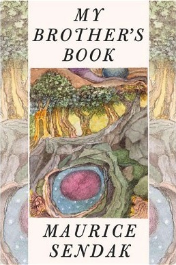
Archive for Art

Vandalizing James Marshall

The only edition of James Marshall’s The Three Little Pigs (1989) currently in print has been vandalized by its publisher, Grosset & Dunlap.  In reprinting the book at 8” x 8” instead of its original 8.5” x 10.5”, the publisher has truncated images, altered the layout, changed the typeface, and removed the final illustration.

Here’s the original:

James Marshall, The Three Little Pigs (1989): second pig builds his house (original version)

Here’s the new version, which crowds the layout, cramping Marshall’s watercolors:

James Marshall, The Three Little Pigs (2000): second pig builds his house (new version, as mangled by Grosset & Dunlap))

Making the text difficult to read, Grosset & Dunlap also changed the elegant Berkeley serif font to what appears to be the title typeface from Sid and Marty Krofft’s Lidsville (1971-1973).

James Marshall, The Three Little Pigs (1989): front cover (as mangled by Grosset & Dunlap, 2000)

And the final image, in which the three pigs take their bow (on the back cover), has been removed entirely.  This is a shame because the front and back cover frame the tale as a theatrical performance.  It reminds us that no pigs were harmed in the making of this story; they were performing a production of The Three Little Pigs.

James Marshall, The Three Little Pigs (1989): back cover (paperback edition, 1996) James Marshall, The Three Little Pigs (1989): back cover (as mangled by Grosset & Dunlap, 2000)

In one sense, what Grosset & Dunlap has done is not unique. Publishers do alter children’s books to make them fit a different format.  When they retain the original design sense, as in HarperCollins’ board-book version of The Carrot Seed, they minimize any sense of loss: the board-book Carrot Seed is still recognizably a work by Crockett Johnson and Ruth Krauss.  However, when they remove text, change layout and design — as in Random House’s board book of Dr. Seuss’s ABC — we end up with a work based on the original, but a demonstrably different book.  (For “L,” the original has “Little Lola Lopp. / Left leg. / Lazy lion / licks a lollipop.”  The board book has only “Lion with a lollipop.”)

What’s baffling in the case of Marshall’s The Three Pigs is the impetus for the publisher’s mangling of his original.  This is not a board book.  It’s a “Reading Railroad” book, and I have no sense what mandates these books being sold in a tinier size.

The practice is of course also offensive.  No one would suggest a slicing up a Rembrandt so that it would better fit in a particular gallery space.  Presumably, the fact that the art is intended for children makes a publisher feel justified in mangling its aesthetics.  Is the font intended to “kiddie-up” the text?  What possible rationale can there be for letting some alleged “designer” (who appears to have no training in design) damage the work of an artist who is no longer alive to protest?  No idea.

I wonder: Do Marshall’s heirs know that Grosset & Dunlap is defacing his artwork?  If they don’t, could someone please notify them?  And ask that they bring back the original work in its original format, please.


Comments (6)

Goodbye, Yellow Brick Road?

Tin Woodsman & Langston Hughes' "What happens to a dream deferred?"

What would Kansas be like without Langston Hughes, William S. Burroughs, or The Wizard of Oz?  What would Kansas be like without art?  That’s what the blog Imagine Kansas Without Art is considering, in light of Governor Brownback’s order to eliminate the Kansas Arts Commission (which, if approved by the state legislature, will go into effect in July).

One answer, oddly, is the Kansas described by L. Frank Baum in The Wonderful Wizard of Oz (1900).  People associate Kansas with Oz, and think of Dorothy (portrayed by Judy Garland) saying, near the 1939 film’s end, “There’s no place like home,” and “If I ever go looking for my heart’s desire again, I won’t look any further than my own back yard. Because if it isn’t there, I never really lost it to begin with!”  But in the book, Kansas is a bleak, grey place.  Sure, Baum was describing South Dakota (where he lived) when he described Dorothy’s home (he hadn’t yet been to Kansas).  But Kansas doesn’t come off as very appealing: “The sun had baked the plowed land into a gray mass, with little cracks running through it.  Even the grass was not green, for the sun had burned the tops of the long blades until they were the same gray color to be seen everywhere.  Once the house had been painted, but the sun blistered the paint and the rains washed it away, and now the house was as dull and gray as everything else.”  Indeed, in Baum’s version, the state of Kansas is nigh killing Uncle Henry and Aunt Em.  She had been “a young, pretty wife.  The sun and wind had changed her, too.  They had taken the sparkle from her eyes and left them a sober gray; they had taken the red from her cheeks and lips, and they were gray also.  She was thin and gaunt and never smiled, now.”  And, as for her husband, “Uncle Henry never laughed.  He worked hard from morning till night and did not know what joy was.   He was gray also.”  In sum, Kansas — according to Baum — is such a grey place that it turns its people ashen and full of despair.

Dorothy’s journey to Oz — which, in the novel, is a real place (and not a dream) — is an escape into color, adventure, and art.  Kansas without these things is, as Baum wrote, “dull and gray.”  That appears to be Governor Brownback’s vision for the state.

I mean, never mind the absurdity of the economic argument.  For each dollar the state spends on the Arts Commission, it brings $2 in federal money back to the state — giving $1 the power of $3 is a strong financial reason to retain the Arts Commission.  Beyond that, the arts bring in revenues from tourism, which help broaden the tax base.  As Kansas Citizens for the Arts points out, “The nonprofit arts and cultural sector is a $153.5 million industry that generates $15 million in local and state revenue. People who attend community arts events also shop, spend money on gasoline, dinner and childcare — contributing to local economies.”  (And, for the record, yes, I am definitely willing to pay more state taxes to support this.)

But even an stronger rationale than the economics argument is this: life without art is bleak.

Image from Imagine Kansas Without Art.

Leave a Comment

Wintertime for the Arts?

Yuko Takao, A Winter ConcertAs we celebrate the birthdays of Mozart (255th) and Lewis Carroll (179th) amidst threatened cuts to arts funding, we might re-read Yuko Takao’s A Winter Concert (1995; English translation, 1997).  Rendered in thin dark lines on a white background, mice walk to a concert.  As the pianist begins to play, colored pointillist shapes rise from the piano: a small red circle, a smaller orange triangle, a purple square.  Displaying the piece’s musical development, the shapes, sizes and colors grow in frequency and variation: a crescent moon of yellow, orange, and red; a globe of many colors.  Soon, a full spectrum of sound washes over the auditorium.  When the audience departs, each member brings along some of that color on the journey home.

Yuko Takao, from A Winter Concert

Music adds color to our lives.  It brightens cold winter days.  It allows us to experience beauty.

Despite what the Governor of Kansas may think, the arts deserve our support.  And I, for one, am glad to pay more taxes, if that’s what it takes. As the protagonist of Leo Lionni’s Frederick (1967) knows, art can sustain us when times are hard.  And, despite news of economic recovery, times remain hard.

There’s a proverb (which may be Persian, I’m not sure) that goes something like this:

In order to live, a person needs two pennies: one for a loaf of bread, and the other for a lily.

If you just have the first penny, you’re merely surviving.  The second penny — the one for beauty — is what allows you to do more than merely survive.  The second one allows you to live.

Support the arts.  If you need a second penny, take mine.

Leave a Comment

The Record

Schoonmaker, ed., The RecordThe Record: Contemporary ART and VINYL, edited by Trevor Schoonmaker (Duke University Press, 2010), is both beautifully produced and delightful to read.  Meditate on the photographs of phonograph-inspired art, or on the dozen or so brief essays, which are — to a person — all interesting.  No kidding.  I often just skip around in a book like this.  But I read The Record cover to cover.

There’s a lot to learn.  As is true of many amateur music collectors, I’ve amassed a fair bit of music trivia (which, in my more optimistic moments, I like to call “music knowledge”), but I didn’t know that Robert Rauschenberg created the original, limited-release cover of Talking Heads’ commercial breakthrough Speaking in Tongues (1983).  Yes, accompanying Jennifer Kabat’s essay (aptly titled “New Feeling,” because that’s what it’s about), there’s a photo of the original 12-inch vinyl LP, in its transparent plastic case with colored foils.  Josh Kun’s contribution begins with Thomas Edison sending Mexican president Porfiro Díaz an Edison phonograph in 1889, leading to an investigation of the “record as a medium of transnational communication” (97) — something which the Mexican Secretary of the Government made official when, in the 1970s, it ordered “that all Mexican LPS be labeled with the slogan El disco es cultura (The Record is Culture)” (98).  Charles McGovern writes of record stores as communities in which “people crossed social lines […] at least for brief moments,” an experience which is vanishing as record stores close (72).

Laurie Anderson, "Viophonograph" (1977)

And there’s the art, such as Laurie Anderson’s “Viophonograph” (1977, shown above), which combines record and violin.  Or Dario Robleto’s “Sometimes Billie Is All That Holds Me Together” (1998-99) which features buttons made from melted-down Billie Holiday records.  And there’s Mingering Mike’s purely fictive album covers (1969-77).  And, of course, the Jeroen Diepenmaat piece reproduced on the book’s cover.

An inch-and-a-half shy of being the height and width of a record, this square coffee-table book is a pleasure to spend time with.  Recommended for audiophiles, lovers of contemporary art, and anyone who likes thinking about music.  If you happen to be near Duke University in the next couple of months, check out the exhibit which the book chronicles.  It’s at the Nasher Museum of Art through February 6th, 2011.  And, if you can’t make it there, the exhibit’s website offers much to explore.

Comments (1)

The Picture Book Is Dead; Long Live the Picture Book

The New York Times reports a rise in visual illiteracy among parents.  Only, that’s not quite the way the article puts it: instead, it notes that parents are pushing their children to read “big-kid” books earlier, steering them away from picture books, on the grounds that picture books are somehow lesser or easier.  As a result, Julie Bosman (the article’s author) notes, fewer picture books are selling, and publishers are cutting back.

None of this may be true, of course. Amanda Gignac, a source for the story, has blogged that her quotation was taken out of context.  And, as MotherReader blogs,

This is The New York Times. And in terms of children’s and young adult literature, this is what they do. Some writer comes up with a topic in this field in which they know very little. They “research” that topic with a few interviews, an observation or two, and a quote from man on the street.

She has a point.  I regularly read the Times’ reviews of children’s books, and they’re very hit-or-miss.  Sometimes, the reviewer will have considerable knowledge of the subject and do a great job; other times, the reviewer knows little or nothing about the field, and muddles through, often to the Times’ detriment.

Margaret Wise Brown and Clement Hurd, Goodnight MoonThough the real cause for declining picture book sales may be the economic downturn (a fact the Times piece mentions but downplays), the article does one thing very well: it accurately reflects the prejudice against children’s illustrators and illustration.  When we write about a picture book, we always put the author’s name first and the illustrator’s name second.  Sometimes, the illustrator’s name comes not after the author’s name but after the title.  And it’s not uncommon for people to forget the illustrator all together.  We refer to Margaret Wise Brown’s Goodnight Moon instead of Margaret Wise Brown and Clement Hurd’s Goodnight Moon or to Margaret Wise Brown’s Goodnight Moon, illustrated by Clement Hurd.  Tellingly, the Times’ reporter quotes one author of picture books (Jon Scieszka), but no illustrators of picture books.

The lack of attention paid to picture books’ artists is just a symptom of our culture’s tendency to dismiss illustration as less serious than writing.  Though Ms. Gignac’s words were decontextualized, the idea of denigrating picture books as lesser rang true to many of the article’s readers — myself included.  We could imagine a parent like Ms. Gignac expressing such a sentiment.  This is one reason why the article prompted so much discussion in the blogosphere and on Twitter.  Those of us who study, teach, or write picture books are used to hearing such ignorant remarks.  The thought that such misinformed people were harming something we love — the picture book — made us upset.

A picture book is a portable art gallery.  It’s also an intricate dance between pictures and words, in which — though neither leads, and neither follows — no step is out of place, no dancers trip.  A picture book can of course also be wordless, such as Istvan Banyai’s Zoom or Jerry Pinkney’s The Lion and the Mouse.  But for most picture books, pictures and words have an interdependent relationship.  The pictures do not simply “illustrate” the words, and nor do the words “name” the pictures.  They work together, often in a creative tension with one another, to make meaning.

Newgarden and Cash, Bow-Wow Bugs a BugI could be mistaken, but I’m skeptical of the claim that the picture book is in peril.  Indeed, I think we are living in a golden age of picture books.  Consider the astonishing work that has been published in just the last few years: Kadir Nelson’s We Are the Ship, Menena Cottin and Rosana Faria’s The Black Book of Colors, Brian Selznick’s The Invention of Hugo Cabret, Emily Gravett’s Wolves, and Mark Newgarden and Megan Montague Cash’s Bow-Wow Bugs a Bug.  All of the books on that list — which is by no means a thorough or representative survey — were published in the last five years.

News of the picture book’s demise has been greatly exaggerated.

Comments (8)

Ruth Krauss: Art, Poetry, & Breasts?

In honor of Breast Cancer Awareness Month, here’s a Ruth Krauss book you might not know: This Breast Gothic, a poetry collection published by the Bookstore Press (Lenox, Mass.) in 1973.  And, yes, the illustration is by Krauss herself.

Ruth Krauss, This Breast Gothic (1973)

The author of The Carrot Seed (1945) and A Hole Is to Dig (1952) was also a poet and an artist.  Krauss began her poetry career in 1959, taking classes with Kenneth Koch at Columbia University.  Her formal training in art began much earlier.  In 1917, she left Baltimore’s Western High School to enroll in the new Costume Design program at the Maryland Institute for the Promotion of the Mechanic Arts (today, the Maryland Institute College of Art).  She never completed that degree, but she did earn one from the Parsons School in 1929.  After two decades of writing children’s books (her first was A Good Man and His Good Wife in 1944), Ruth for the first time illustrated her own.  In 1964, she published The Little King, The Little Queen, The Little Monster and other stories you can make up yourself, featuring pictures she made up herself.

From then on, she would occasionally illustrate her own work.  This Thumbprint (1967) features her own thumbprints, and (as you can see) This Breast Gothic displays a portrait of a woman who is mostly breasts — 11 breasts in all.  Wild, explicit, and vibrant against its pink background, the image suggests new meanings for the title poem (“This Breast”), inviting a rereading of lines like “This breast boom-boom yippee slurp strawberries cabañas / This breast as we go whizzing along,” and “This breast we have a fine view of everything that happens.”  Suddenly, the poem seems an exuberant celebration of the female body, giver of life and of food.  With a whimsical touch, Ruth’s poem now points to a woman’s power: from her breast comes art, literature, cities, history, news, … everything.

And, yes, in addition to Breast Cancer Awareness Month, this blog post is also promoting my book, The Purple Crayon and a Hole to Dig: The Lives of Crockett Johnson and Ruth Krauss, forthcoming from the University Press of Mississippi in 2012.

Leave a Comment

A Is for Art: Stephen T. Johnson’s Abstract Alphabet

Stephen T. Johnson, A Is for Art (cover)Part children’s book and part lesson in twentieth-century artistic movements, Stephen T. Johnson’s A is for Art: An Abstract Alphabet is at the avant-garde of alphabet expressionism. Cubism is here, but the work explores the influence of dada and its children—surrealism, pop art, and conceptual art—and other styles such as abstract expressionism and color field painting. The result is a provocative meditation on art and language.

Invoking the mid-twentieth-century French avant-garde lettrist (letter-centered) work of François Dufrêne, Johnson in Arrangement No. 1 tears type from, as he describes in a caption accompanying the work, “an array of abstract bits of advertisements,” arranging them across strips of vivid orange. Stephen T. Johnson, A Is for Art: An Abstract Alphabet.  A.  Arrangement No. 1Amplifying the “A”s, Johnson describes how he has aligned small “apostrophes, ampersands, accents, and an asterisk,” around a dark “angled letter A.” Recalling American artist Man Ray’s Mystery of Isidore Ducasse, which is a blanket-and-twine-wrapped sewing-machine-sized object (it is a sewing machine, but the viewer cannot see it), Johnson’s Wrapped Wishes — devoted to letter “W” — invites the viewer to imagine what she or he sees. Wax, wool, and wire wrapped around unknown objects entice us to “wonder what is within.” In the aptly titled Recycled, a readymade assemblage of red and blue rubber bands spans a resin-filled frame. Encouraging the proliferation of “R”s, Johnson calls it a “rectangular receptacle,” and describes the bands as “rendered rigid by resin.”

In his art, Johnson maximizes the possibilities of each letter. The punnily titled Ice Cream Floats presents, as he writes, “an installation of individually illuminated, isolated, immobilized immersed and inverted identical insoluble imitation ice cream cones.” As that description suggests, these objects are multi-layered alphabet games, with images and captions that resonate in many directions. Stephen T. Johnson, A Is for Art: An Abstract Alphabet.  U. Untitled.The op art (optical art) piece, Untitled (from the Undulation Series, 2006-2007), incorporates an “upside down, underlined upper case U with umlaut,” against an ultramarine blue background that appears to undulate. Jambalaya offers an homage to French-born American artist Arman’s “accumulations,” such as his Poubelle Papier (Wastepaper Basket) , while exploring “J” with, as Johnson’s caption notes, “Jampacked juxtapositions of jagged, jammed, joined and jumbled junk.” Careful examination reveals multiple iterations of “J” tucked into a fold of metal or at the intersection of one aluminum slice and another. As with all of Johnson’s works, the more you look, the more you see.

A is for Art: An Abstract Alphabet takes the letter-hunting game of Johnson’s Caldecott Honor-winning Alphabet City (1995) to another level. That book’s clearly articulated, easy-to-find letters should please those for whom the alphabet is a recent acquaintance or a passing interest. Stephen T. Johnson, A Is for Art: An Abstract Alphabet.  Q.  Quiet Time QuiltBut An Abstract Alphabet is for hard core abecedarians, alphabetic connoisseurs who crave a richer experience. As such, Johnson’s work is among those alphabet books—such as Dr. Seuss’s On Beyond Zebra! (1955) and Michael Chesworth’s Alphaboat (2002)—that probe the paradox of language, a system practical and impractical, a means of communication and a game played for the fun of it.

Oscillating between each side of the paradox, Johnson’s densely allusive works abstract letters from their function and bind them to their function. Packing each alphabetic portrait full of references makes meanings multiply, reminding us how words always have indications elsewhere. Yet, even as it highlights language’s slipperiness, Johnson’s An Abstract Alphabet also forges connections between words and things. Indeed An Abstract Alphabet might also be called Concrete Alphabet: Johnson offers comically literal renderings of each letter, complete with witty, alliterative captions like Quiet Time Quilt’s “Queen size quilt, quartered by quadrants, with quadrilaterals, question marks and quotation marks.” The work has all of these features, along with the attributes of examples of late-1960s American art such as the geometric stripes of Frank Stella’s shaped canvases or the bold typography of Robert Indiana’s sculptural poem LOVE.Stephen T. Johnson, A Is for Art: An Abstract Alphabet.  H.  Hoopla!

Beyond exploring language and artistic approaches, Abstract Alphabet catalogues Johnson’s artistic versatility. As an artist, he is capable of rendering realistically detailed portraits, painting abstract mathematical ideas, and creating minimalist installations. As a realist, he gives  details to the parrot in Pop Quiz, such as the texture of the bird’s red feathers and a sharp curved beak. Exploring mathematical concepts, his Golden Sections depicts the golden ratio, incorporating a Fibonacci Spiral — a mapping of the Fibonacci Sequence, where each number is the sum of its two predecessors (1, 1, 2, 3, 5, 8, 13, 21, and so on). The hanging hollow hula-hoop forms in Johnson’s Hoopla! recall the pliant minimalist works of German-born American sculptor Eva Hesse (another “H” word!). Through painting, collage, sculpture, and readymades, Johnson’s Abstract Alphabet is playful, questioning, and profound.

Note: this originally appeared in Alphabet Soup: Work by Stephen Johnson, Jim Munce, Tony Fitzpatrick (exhibition at Beach Museum, Kansas State University, Manhattan, KS, 4 April – 3 Aug. 2008); an earlier version accompanied An Abstract Alphabet: New Works by Stephen Johnson (exhibition at Spencer Museum of Art, University of Kansas, Lawrence, KS, 19 May – 5 Aug. 2007).

Stephen T. Johnson, A Is for Art: An Abstract Alphabet.  P.  Pop Quiz

Leave a Comment